Sharp Thin Serif Font Recs
- Started
- Last post
- 12 Responses
- TheAnthonyWallace
Any recommendations for a professional/really good looking headline font that is along the lines of Garamond Pro or Hoefler Text, but sharper and slightly thinner?
- hans_glib0
you can never go far wrong with trajan, though i admit it's corny.
- WhiteFace0
Felix Titling?
- MrT0
- Continuity0
Emona has some lovely contrasty things going on:
http://www.myfonts.com/fonts/lin…Leitura News is also lovely, though more so as italics IMO:
http://www.myfonts.com/fonts/dst…And, really, you can never go wrong with Klim's Galaxie Copernicus:
https://klim.co.nz/retail-fonts/…- pff copernicus is just plantin made less goodhans_glib
- Oi, oi. It's made gooder, sir.Continuity
- i disagreehans_glib
- utopian0
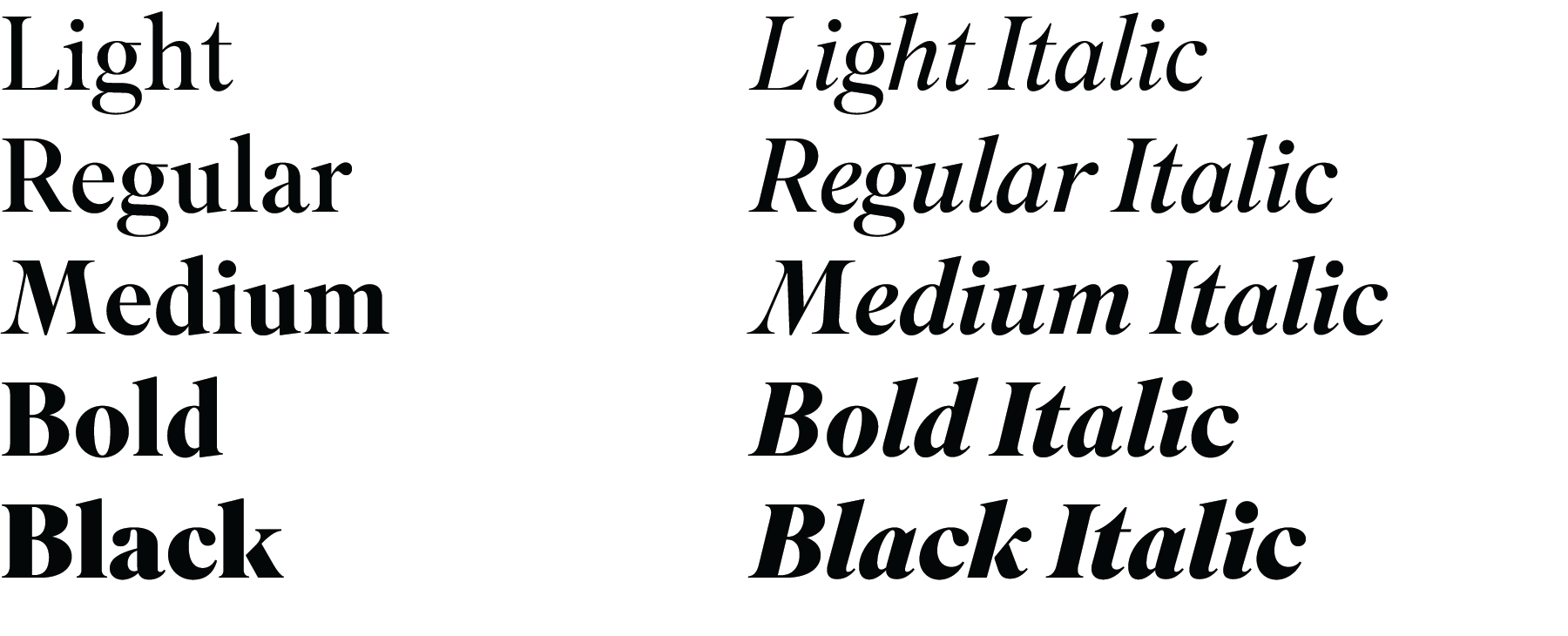
Chronicle Text
http://www.typography.com/fonts/…
- utopian0
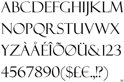
AlexandriaFLF
http://www.fontstock.net/12369/a…
- utopian0
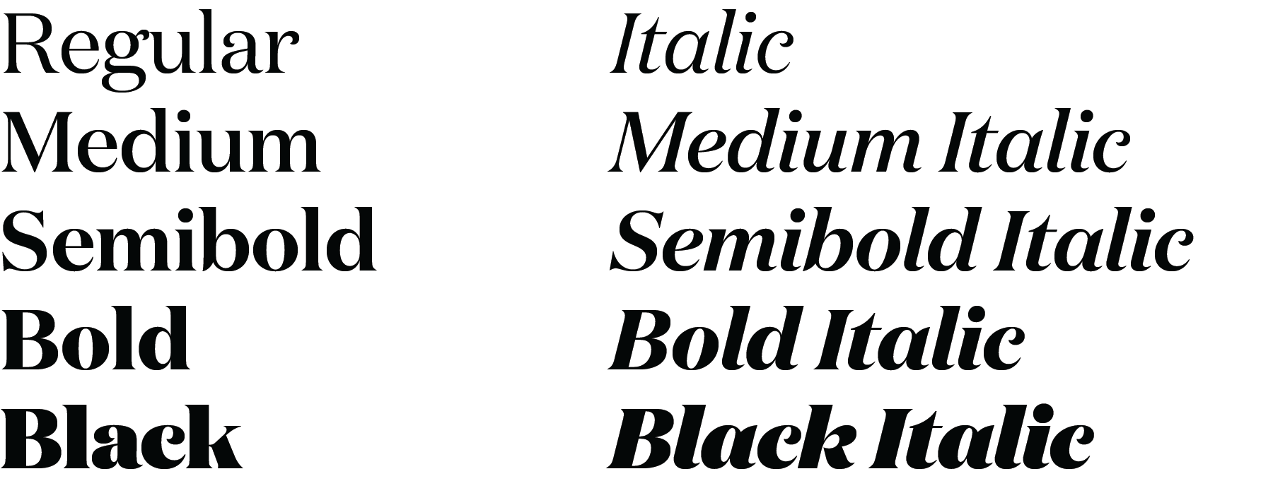
Mrs Eaves
http://www.myfonts.com/fonts/emi…
- ********0
Aria Text. Maybe too fat for your liking.

- skwiotsmith0
Domaine Display / http://vllg.com/klim/domaine-dis…
Superior Title / http://vllg.com/mckl/superior-ti…