WTF
WTF
- Started
- Last post
- 4 Responses
- indian_pole

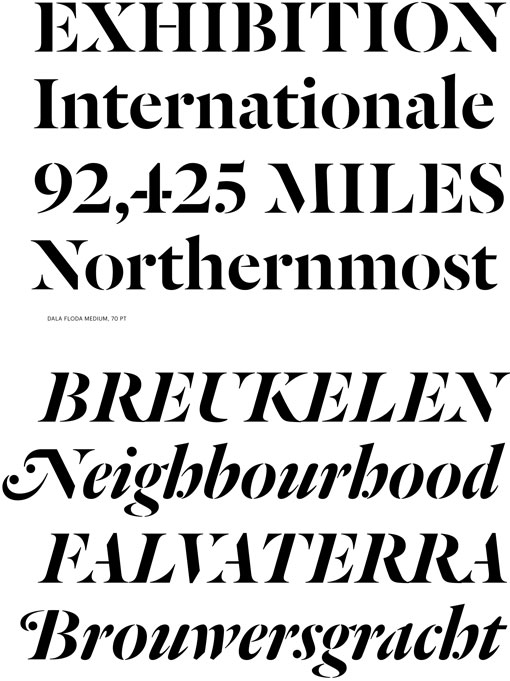
i think its been doctored but looking for a similar font with really sharp serifs and super thin lines
- Continuity0
Looks like a tweaked-out flavour of Didot.
- pressplay0
- ooo commercial type for the win (but not his font)doesnotexist
- detritus0
If you're just after this for a header or logo design you can achieve this effect with pretty much any half decent serif font - just add a white stroke on 'til you get the look you desire, outline the stroke then subtract it from the underlying glyph.
I based a logotype on this a couple of years back after exhausting a few fonts designed in this style, as linked above.
- "half decent serif font with a thin stem on one side", I meandetritus