Funny or Die
- Started
- Last post
- 13 Responses
- dbloc
cleans up their logo
OLD
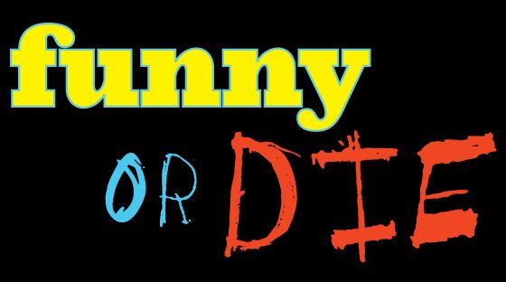
NEW

- monospaced0
Awe, did some Yahoo interns lose their jobs?
- CALLES0
Die
- cannonball19780
The OR looks awkward. O needs to be flatter
- GeorgesIV0
ahahahhahahahahaahha
ahahhaahhahahahahaha
ahahah
I just died inside :(
- ernexbcn0
Better.
- ********0
Designed by the people who wear these kind of meaningless tees:


- ********0
<strong>?</strong>
- PonyBoy0
def. better... but not that great.
This feels like it was one of the fodder logos tossed into the mix to thicken the choices for the client... and woops— the client picked it and the designer is now kicking themselves for slipping that one in there
- helpmeqbn0
Needs same equal space between "or" and "die" as "funny" and "die".
- BaskerviIle0
Could have been so much more.
Maybe it's just me but I think that cap D is calling out to be a smile or something. The name itself is essentially the old theatre masks, comedy and tragedy.
Here's my 2 second sketch (in time honored tradition of pitching in where our help isn't wanted/needed), but this definitely could have been better, or at least more interesting:
- http://www.designbyh…cbass99
- looks like the DBH logo
http://www.designbyh…dbloc - never seen that before. I like this theatre logo though, subtle:
http://d11ww39v4tlqx…BaskerviIle - this doesn't work imodbloc
- I agree, but was just looking for something in there. give it a tryBaskerviIle
- could be used for something else. cool start.ohhhhhsnap
- ********0