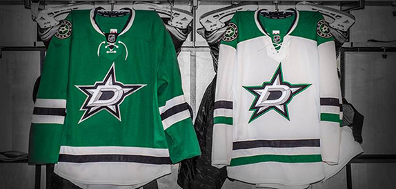
New Dallas Stars Logo
- Started
- Last post
- 11 Responses
- _niko0
bit of a mess.
Jerseys look like a canadian beer league team Dartmouth stars or something
- ernexbcn0
Better.
- dbloc0
anything is better than what they had.
- fredddddd0
Old one wasn't good, but the new one is way worse. Looks like a crappy beer.
- ideaist0
It's a medley of all kind of shit and:
- tOki0
People often hate on these rebrands for various reasons whether it be from a nostalgic perspective or a design one. Personally I don't mind it.
Would be fun to get a project like this, as there is so much work to do merchandising the brand across the different applications.
- tOki0
People often hate on these rebrands for various reasons whether it be from a nostalgic perspective or a design one. Personally I don't mind it.
Would be fun to get a project like this, as there is so much work to do merchandising the brand across the different applications.
- cbass990
Northstar's Logo was way better. Fuck you Norm Green!
- i_monk0
They should have worked the lower corner of the D into the star somehow.