Logo Criteria
- Started
- Last post
- 84 Responses
- ********0
Dear people, don't get me wrong if i don't reply from now on.
I have to have some rest and be at the doctor around 10am 8in 5 hours) and from there to work until the evening.Thank you all for the input!
Will have to ask for some more time.
Still have to finnish a front of a record cover (2000x200 image for web record shop) and a flyer from scratch until friday.Among other work and tasks.
Hopefully i'll wake up with some new ideas or decided into one specific direction.
Thanks again!
- ********0
I will give news or show some developments tomorrow evening.
Cheers!
- fresnobob0
Actually, I think this part of the logo

is awesome. It reminds me of this
which I think is a good thing... And it has tons of character. Plus, I think the logo is so old that its now hip again. New wave-y floaty shit is all the rage. If it was me I would just fix the really ugly K and !, make em more geometric or something, and then add some cool new wave type for the Tomorrow is Now Kid stuff. Add some emphasis with a couple different fonts of the same typeface or something like that so they fit together more....
- ********0
I didn't started yet...

- i_monk0
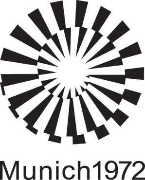
1. Take one of these (or something like it):

2. Superimpose the wordmark (draw it, even if you go big geometric chunky).
3. Delete the parts of the swirls that fall outside the letters, and then knock out the white parts of the swirls where they cross the letters.
4. Stick "Records" somewhere nearby.
- damn! that's a heavy task but totally worth trying. fresnobo's idea is also great. as well as amicus advice. have to try both********
- not sure about the time. but I will give it a try. i hope i have the energy.********
- damn! that's a heavy task but totally worth trying. fresnobo's idea is also great. as well as amicus advice. have to try both
- instrmntl0
These are cool
- i_monk0
instrmntl posted this in the note:

This is naice. I think it's a watermark or something, but the illusion of shading gives the thing dimension.
- ^i_monk
- looks like a tube (wave). gives dimension and dynamics.********
- Totally. Reminds me of Alice n wonderland. You're entering the rabbit hole of vinyl!instrmntl
- hahaha! fuck! thanks! fuck! i need to sleep and I'm already doing what fresnobob's suggested. results not soon.********
- Good luck man!instrmntl
- thanks! you guys are great!********
- ********0
First try...
I have to but I can't go to sleep.
- First try around fresnobob's suggestion. maybe he was picturing something different but i'm still working on it.********
- I think this is getting somewhere. Try without the swirl. And try with a smooth swirl... same number of rings.Amicus
- Yeah, totally along the lines of what i was thinking...fresnobob
- First try around fresnobob's suggestion. maybe he was picturing something different but i'm still working on it.
- Complexfruit0
Along with what others have suggested on the swirl, what about trying to render the swirl in a different way. Maybe more geometric, maybe 3D, maybe more hand drawn, etc. Push the swirl a little more. I think the swirl is what will make or break your redesign of the logo. Good luck!


- ********0
- ********0

- ********0

- SoulFly0
We can't wait until tomorrow to see this.
Post the new files!


