Flat Design
- Started
- Last post
- 180 Responses
- ideaist0
- Yeh this has been bouncing round twitter like a mofo, but no reliable sources yet.Hombre_Lobo
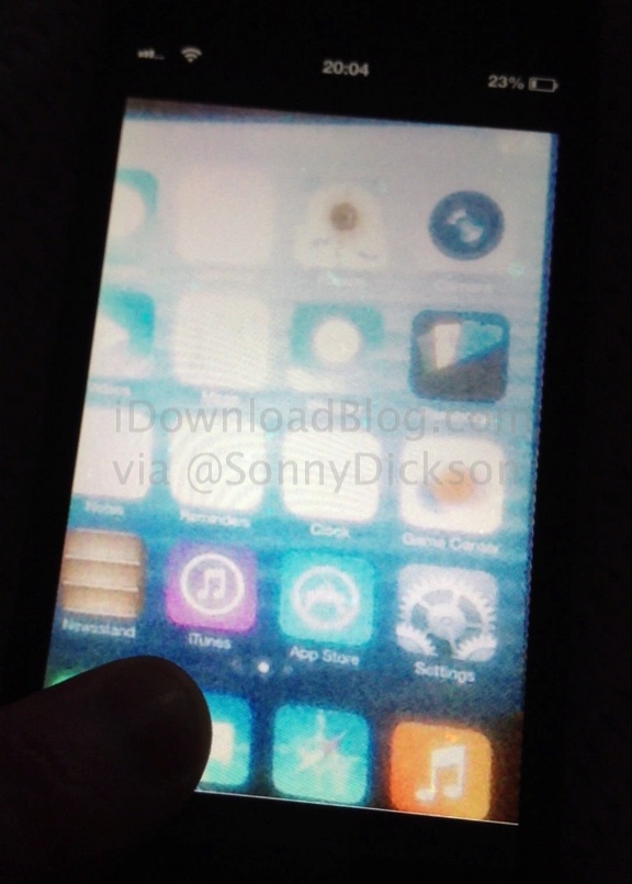
- what are we looking at here?monospaced
- so they didn't change anything after all.. wowMiguex
- this photo emerged before the WWDC last monthtymeframe
- wagshaft0
If anything, I've picked up a good word in the comments section from one of these many links:
“skeuomorphic” – A skeuomorph is a physical ornament or design on an object made to resemble another material or technique. Examples include pottery embellished with imitation rivets reminiscent of similar pots made of metal, or a software calendar application which displays the days organized on animated month pages in imitation of a paper desk calendar.
- dMullins0
Largely, this conversation is couched in web and mobile, and not so much print. I personally love that a 'flat' approach to websites and apps is where we're at this year. It's a nice departure from the skeuomorphic garbage, or vintage trends, that designers were hooked on last year and the year before. Technology is really the reason for the trend. Work with any designer who is on top of their shit, and the number question you will hear them ask is, "How performant will this be?" iOS and Android now support some really dynamic 3D transitions and animations, which become really a bitch to pull off with the wild and crazy over-the-top designs people have been designing in recent years.
This return to basics is much needed in the industry, and I for one completely support a more performant, responsive, and simple-but-attractive web/mobile world.
- "Work with any developer who is on top of their shit," I meant to say.dMullins
- lessfloor0
Flat is Fat
- see_thru0
Love this app...

- Continuity0
So, I guess the 'new' trend for 2014 will be 6pt aliased pixels fonts and glowing grid lines in backgrounds, yes?
- sine0
is Windows 8's interface pushing this trend in app design?

- to me it seems like an easy way to have your apps look current and fit in with new os looks. not just microsoft. android has a similar look.sine
- similar look.sine
- simplify, roll out quickly across multiple platforms (?). more a functional trend than an aesthetic one (?).sine
- and possibly also influenced by touch-screen functionality and "baseline" interactive requirements...sine
- on multiple devices and interfaces.sine
- lessfloor0
Phat, also works better responsively so long as it's all vector
- OSFA0
Echoing recent reports about a redesigned 'flatter' user interface in iOS 7, 9to5Mac says the next version of the operating system will lose "all signs of gloss, shine and skeuomorphism".
- itsricky0
This conversation is really depressing. I was hoping we could talk and celebrate this new trend, rather than be chastised by elitist desginers who feel that the 'flat' style gaining popularity is ruining the world.
Flat design is democratic, its a beautiful thing, aside from the colours and layout. It renders the web readable to a whole new group of people, cast out BY US with our 10pt pixel fonts and hacky HTML UI.
Its about users getting in, getting the info, and getting out, fast, with as little friction from the design as possible.
Generally speaking, in the modern world we live in guys, if a 3-D-blingly-sparkly video enhanced 2X retina mega object is getting in the way of your content, and the 'design' is visible, then thats not good design.
Good Systems are invisible, but good design is beautiful. Good design is fast, and it just makes sense.
So the lowest tier of web users in the world... Those with not good english, those who have one eyeball, the colourblind, and little kids. Think of the little kids who use the internet as their primary source of learning.
Now they can actually read and understand the information on the web, because the bloody design's out of the way.
Again, its not about how Flat design looks, its about what it DOES.
- prophetone0
personally, i think it's the cat's ass
- ukit20
What are the implications for companies that just launched new 3D, bevelled version of their logos?
- i_monk0
^ more on that here:
http://techcrunch.com/2013/04/29…Didn't Apple used to be a design leader?
- Design is about how easy it is to use, not what it looks like.mikotondria3
- Saying that, I've never owned an Apple product, and have only ever used one for about an hour in total. I was like 'meh'.mikotondria3
- < absolutely wholly colossally and absolutely uninformedset
- who, what ?mikotondria3
- visual design is part of the design process, making things attractive makes them easier to use.zarkonite
- 'attractive' is not something measurable and cannot be engineered.mikotondria3
- pig0
Not sure if timeline, but...
***Apple UI due "major overhaul" that could be "unsettling" to current iPhone/iPad users.
Jony Ive behind new "Innsbruck" design that disposes of skeumorphic in favour of flat.
- fadein110
Well its nice that some of the other big players are driving the current design trends rather than Apple... look how quickly their big trend looked naff. Clean and minimal doesn't date as quickly as glassy buttons and leather backgrounds.
- Mountain Lion's Address Book, for example? *puke*Continuity
- lessfloor0
- <refunktion
- Designers, in a design discussion on a design forum maybe?inteliboy
- toe_knee0
Apple copying microsoft. Steve turns in his grave
- Nathan_Adams0
The problem is though when this "flat" UI design get's taken too far, and you can no longer tell clearly what are UI elements and what is just content. Subtle cues go a long way.
- instrmntl0
It's funny that Apple whored out 2.0 shiny skeuomorphic design that's there's now a backlash/trend against it.
