WTF?
- Started
- Last post
- 6 Responses
- Kiko
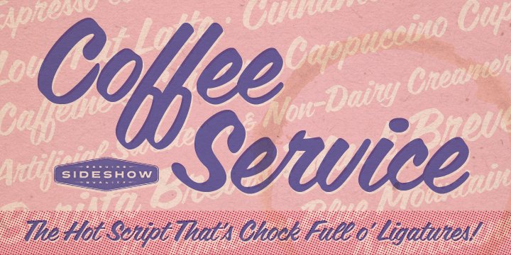
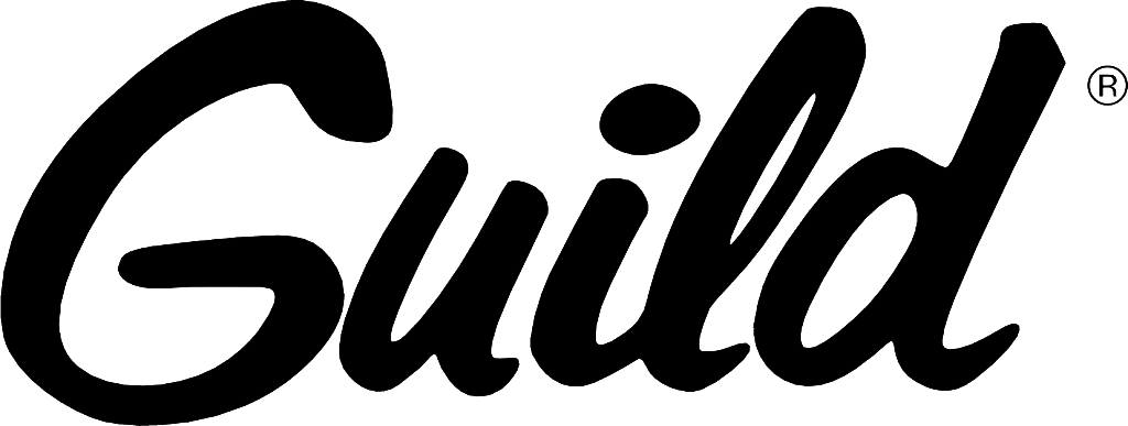
Any ideas of this font, or is it a custom logo?
If it is a custom logo, does anyone know how this is done best? I have tried for years to make script type and when taken into illustrator it just looks shite!
Thanks
- ESKEMA0
That's a nice script.
- rodzilla0
Best way I've found is to pen tool something out find a base and trace dead center. Then I used the "width" tool (on the stroke) to create my own weights on the letters. Its hard to make uniform, but with tedious work and a good eye you can make things look pretty good.
- monospaced0
Best way is to get a fat marker and some paper and start writing. After about 20 attempts you'll have something worth importing (scan/photo) and tracing (manually, not auto). Follow the strokes your hand made, not just the outline of the letters, letting the strokes overlap (like on the "l"), using the fewest points as possible. It goes quickly this way.
- Kiko0
hey Monospaced, I have to agree with you there! I have never tried that before, but just after trying and trying again I think Ill need to practice my caligraphy.
- MrT0
Also worth writing/resolving individual characters and assembling them afterwards. You don't have to do the whole word in one go each time... an easier alternative for lettering mortals like me.
- I find that when I do them individually they dont flow as well personally.Kiko
- Furry muff! It was advice from this dude, so I was convinced... http://f.cl.ly/items…MrT
- tOki0