Pub/bar logos
- Started
- Last post
- 36 Responses
- 23kon0
Some goodies from Google to get you started ...


- armoury stuff is really nice. good mix of old imagery with modern type23kon
- Clementine's Clip Art Depot.CanHasQBN
- http://b.vimeocdn.co…
Conservation InternationalAmicus - The Dirty Dev in Balham and The Armoury in Wandsworth...
Lost my mind and pull in these numerous times...nylon - The Armoury looks so far up its own arse.Chimp
- It doesn't look genuine. It says "I've just been gentrified" Although that might have been the briefChimp
- mydo0
good pubs don't need logos.
hand painted hanging signs.
Gold lettering on windows and panels
maybe, just maybe a small crest if you need something on the menu.
http://www.thefoxandhoundspub.co…- i agree. that kind of corporate shite in the post above just warns you to stay away.hans_glib
- but that's not much use to the OP who needs to make a buck from the corporate shite!hans_glib
- lolset
- Spot on. It really makes you question what is 'good' design.
As a piece of Design the Armoury is great but...Chimp - ... but it would put me off going there as it appear to be more of a 'gastro pub' rather than a 'boozer'Chimp
- Raniator0
Thanks 23kon... I like the first and last.
mydo... you might be right actually.
I was thinking of only doing a wordmark anyway. The is an animal in the name though so it would make sense to incorporate that maybe.
- mydo0
The DevonShire, just says overpriced mass produced corporate food with a description along the lines of... A trio of farmhouse sausages with a caramelised onion jus, served on a bed of hand crushed potatoes.
- mydo0
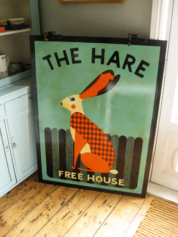
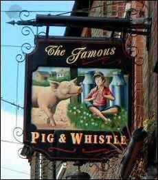
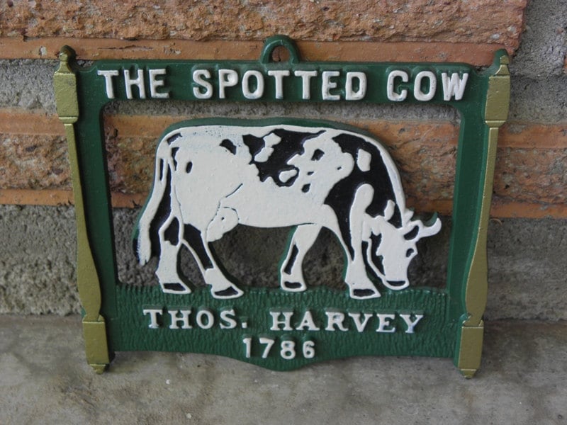
from a quick google search, the following made me thirsty...

- I want tacosmonospaced
- Now that looks like a pub I'd like to drink inChimp
- mydo0
- mydo0
- mydo0
- utopian0
Park Bar
15 East 15th Street, New York, NY
(212) 367-9085
- goldieboy0
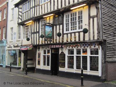
Your font choice doesn't feel 'Traditional' enough for an 18th Century building.
- pig0
Is this the pub?
- pig0
What did you talk about in the brief with the owner? Do you have carte blanche, or does they have preferences?
If you have free reign, look at what mydo, DaveO & co. were saying earlier because this is precisely that. It's careful and contrived for what is a totally traditional looking venue. The pheasant illustration is clean and well rendered, but therein lies the problem, squire.
People don't want pretense from a pub, they want sincerity. I'd go handmade handmade handmade. Do a modern lick on the original signage. Get your hands dirty. Look at stupid ale labels. These are anti-design, but they're fucking great!
Props for having the courage to put your work on here in the first place, though.
- Does they (groan)pig
- < good advicemonospaced
- Yeah really good advice. Thanks pig.Raniator
