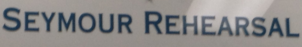
Gotta try and match the font for some signage. Any takers?
http://www.tumblr.com/blog/bobka…
Must be copperplate. What's not quite?
That's what I rekon but others in the office dont. They think the 'R' looks more squat - I think it's the perspective on the photo that makes it look like that.