Whats your favorite font
- Started
- Last post
- 31 Responses
- tOki0
Such versatility and strength!
- big-papes0
not a joke...
- inteliboy0
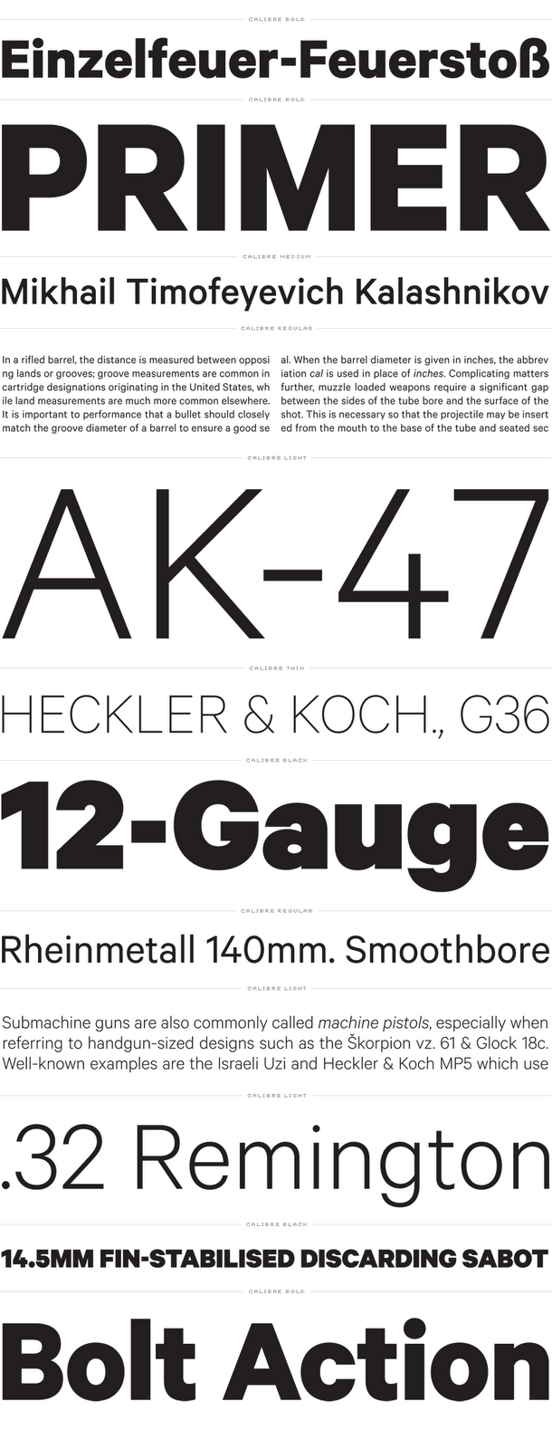
Chronicle

- ok_not_ok0
Nationail

end of thread.
- maquito0
I'm finding a hard time to let this one down for anything... I'm in love with it.

- cherub0
Besides huge headlines and regular text, which is obvious, I don't know which font "feels" go with which kind of copy/layout/situation.
- maquito0
cherub, you should exercise with different fonts -serif, humanistic, roman...- and maybe that feel you mention, should then be revealed by the context.
I believe the difference is not only in the details of each font, or each glyph of the font, but may also be noticed in a big block of text. "Regular" text does not have to be standardized; a block of text has a color, has character, and even a sound... Maybe I'm being to anal, but I strongly recommend you to try new stuff!
- word "anal" and "try new stuff" in the same sentence, pun def intended ;Pmaquito
- "open minded typeface wanted"cherub
- try OpenSans, no pun intendedmaquito
- the light 300 looks sharp on desktop & webmaquito
- It's vibrant and spacy! I been messing around looking at letters, and I do like the uppercase verdana J better, andcherub
- I have discovered that some forms are not as likeable, like the lowercase opensans g for instance, but at tiny sizes are more readable.cherub
- I would have guessed those unusual forms of letters would be less, not more readable. So that came as a surprise.cherub
- cherub1
Oh I see what you mean about blocks of text. I never saw the distinction, I guess it's talking about eyes moving down and recognizing shapes rather than moving across(headlines)
- Pixter1
DIN
- VectorMasked0
At the moment I still enjoy working with Stag. Elena is another I'm using quite a bit too.