Help with Monogram-Logo
- Started
- Last post
- 24 Responses
- Ambushstudio
Dear friends, we´re a bit stuck with a project right now, a tad blocked and wondering where to go with this matter.
We´re trying to make a logo with a monogram look, the initials of the two words combined leave us wit a double T.
We´re looking for nice, logical ways of combining 2 T´s on the same physical space, they should touch and exist together all the time.
complicated much...
Any reference or ideas are greatly appreciated.
- Horp0
Oh we're 'friends' now are we? now you're a bit stuck with your logo design.
- neandersthal0
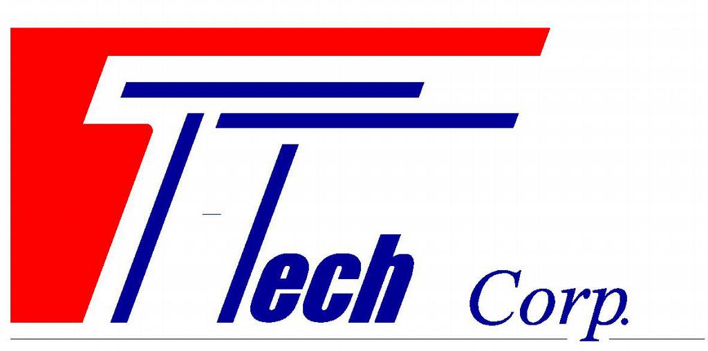
Texas Tech.

- go raiders, I payed to get in he´e soo i can say whaevve a want http://www.youtube.c…
ArchitectofFate
- go raiders, I payed to get in he´e soo i can say whaevve a want http://www.youtube.c…
- epill0
this is sorta connected..

- doesnotexist0
don't think too hard

it will show
- neandersthal0
Tidningarnas Telegrambyrå.

- thecreativefire0
whenever i'm writing and there are two Ts next to each other I just push them real close and have one longer bar across the top. I guess this makes a really simple ligature.
- ...and also a πuan
- is that the pie symbol?epill
- pie, yes.doesnotexist
- mmm. pie (and chips!)thecreativefire
- dirtydesign0
which one of these do u think is getting ripped off for the project?
- Josev0
Does anyone work on their own ideas or concepts anymore?
- ********0

- gramme0
This doesn't seem particularly complicated to me, friend.

- Ambushstudio0
Thanks for all the references, the images were really helpful.
Yes we work on our original concepts, nothing getting ripped, actually stuff like this help us not to do stuff that looks like other things by accident.
It is not a complicated thing, I just wanted to see other peoples take on it, and I get it kids, we're not friends.
- mantrakid0
business partners, now, right? you have to split your mockup fee amongst the qbn peeps who rallied for you.