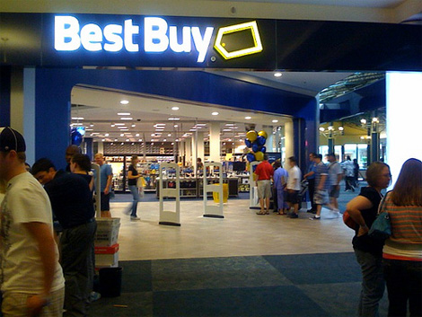
New Best Buy Logo
- Started
- Last post
- 20 Responses
- dbloc
I like it.

- omgitsacamera0
Reminds me of Walmart. Looks nice though.
- neue75_bold0
you have to admit, the bar had been set pretty low though.. pretty hard not to improve on the old one..
- Christian0
It is better but I just don't know. The type feels week and the tag makes the whole thing look crooked.
- Amicus0
cool. they have anti-gravity price tags!
- wagshaft0
Gap version?
- HijoDMaite0
This guy is out of a job

- http://www.asianunit…HijoDMaite
- fuck it. it was the "best buy guy"HijoDMaite
- LOLutopian
- akrok0
the tag is better now when its has a edge. gives it a bit of a arrow shape. pointing a tad down. = low prices?
- randommail0
sheesh. it's a horrible illustration of a tag.
- Gucci0
That tag is begging to be turned into the head of a penis. It's better than the old one. Smart typeface.
- benfal990
and yeah, too much Facebookish
- sublocked0
better than it was
- ********0
This is not sarcasm, but I thought they had already rolled this out a while ago? I feel like I've seen this before.
- utopian0
Facebook + Walmart = Bestbuy®
- CanHasQBN0
this is ooollllld old news. like a year and a half. they don't seem to be rolling it out much. i haven't seen it anywhere.
- ********0
april fools?
- ********0
It's kinda bank-ish.
a bank of electronics, perhaps.
pooooooooop.