Urgent: Design Feedback
- Started
- Last post
- 22 Responses
- SeriousFreelancing0
Relaxing is completely unwinding... I think there are some redundancies in that line.
Thoughts:
- "island" looks like a piece of chocolate, or an excavation site... make it look like a dream vacation.
- Pools of blue look like pools of blue blood.
- The book now "standing out" is a good thing.
- Everything under the header graphics looks like it needs imporvement... needs to pop more... I feel like I'm working too hard to understand what's going on down there.
- vaxorcist0
Somehow I need to see some charisma, some feeling of what the place is like vibe-wise, feeling-wise, taste-wise...
This often happens when the client is rather vague and the designer has to pull stuff out of their ass without much to go on....
- utopian0
IS IT JUST ME... or does this looks like it was designed by a UX developer or programmer... I personally do not care for it at all...
- dMullins0
Looks good. I love Jewish design.
- lolliveforever
- Jewish?pauliusuza
- dMullins is from the south, what do you expect?SeriousFreelancing
- nb0
I guess if the client loves it, then great, but the entire design looks more like a site for a new iPhone app or jquery plugin or something.
The drop shadows, rounded corners, colour palette, the background image (at the top,) the illustration, the contrast are all conflicting with the idea of "warm hospitality" and "simple elegance."
- too late bro. the client, he loves it.zenmasterfoo
- Well the hotel is modern and it's different than competition. The text will have to change a bit I guess.pauliusuza
- Ah.nb
- pauliusuza0
Client loved it! I will incorporate some of the tips you guys left here. Thanks for the feedback everyone!
- zenmasterfoo0
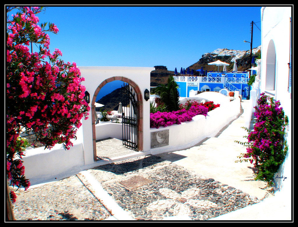
I've actually stayed at the Astra. it's beautiful. The graphic you have is cool, especially the tooltips. That's nice...photos within each would be nice. BUT, what I know of the place is that the view is amazing. That graphic makes me think of some kind of moon base or mars exploration facility.
Use it but use photos of the location as the main image. It's just too beautiful there to not do that.
- toodee0
You've got this far without showing anything to the client?
- yeahpauliusuza
- well, I had sketches for almost every design element on first meeting
pauliusuza
- goldieboy0
Have to agree, the illustration doesn't say this:
'... philosophy of warm hospitality combined with a simple elegance, island tradition and serene atmosphere has made Astra Suites world renowned!'- totally agree, its a cold architectural drawing, not warm at all.Hombre_Lobo_2
- pillhead0
The main Illustration is just not working for me.
- Continuity0
Here's something Less Rain in London did for a resort in Greece. It's a Flash site, but the principle of it is kind of what I was thinking of:
A lot of the same things could be achieved with JS.
- Yes. This is well known in Greece. However their customers base is bit different - Santorini = weddingspauliusuza
- And Santorini = legions of Serbian tourists. :DContinuity
- Continuity0
An image like this you could probably get away with, because there it's a whole lot going on in it (so it wouldn't compete with the design elements and content), but - at the same time - it looks really inviting.
- *isn't a whole lot going on, ratherContinuity
- I'll try something, thanks.pauliusuza
- Continuity0
Looking at it again, I agree with liveforever in that a technical architectural-style illustration really doesn't speak to the idea of holidays in Greece.
If you have more time, you might want to play around with humanising (for lack of a better word) your design, in order to invoke the right emotions in your target viewers: deep blue sky, clear water, the quaintness of the surroundings, and so on.
Maybe you can play around with a full-bleed background photo using jQuery, with content areas overlaid on it?
- Yes. It's very difficult to do that without overcrowding the design. But maybe add more depth - clouds?pauliusuza
- Nah, clouds you get anywhere on Earth, it's not Greece's unique selling proposition.Continuity
- What's unique to santorini - it's architecture (those rounded roofs), and that it's a frig.. volcano.pauliusuza
- liveforever0
doesnt look like you have a grid system and nothing aligns
margins aren't proportionate
the illustration and colour doesnt make me think "relax and unwind"
the height of those boxes would prob be better if they all were the same .....- Thanks. Colors are what you will see there - white, blue and brown. Grid will be improved, this is not final. Boxes are dynamic, so I don't know the heightpauliusuza
- ...so I don't know the amount of content that will be there.pauliusuza
- Jimbo820
Probably just me but I read
"Come, relax and completely unwind at Astra Suites..."
as
"Cum, relax and completely unwind at Astra Suites..."
I'm tired.
- Well, makes sense really. I don't know about the rest of you, but I tend to relax after I've come. :PContinuity
- Ran through my mind couple of times too... :)pauliusuza
- < I'm with stupidSeriousFreelancing
- Miesfan0
Remove the drops, it seems otherwise.
3D image says little about what to expect of the place (physical location). And little good. Less F, Twt...
About the logo no time, if it's urgent.- Aerial image would be to crowded, that's why I've drawn this, to simulate the ambient leaving the neighbors out.pauliusuza
- looks good!...:)Miesfan
- Thanks man!pauliusuza
- ian0
Well I think the huge yellow button clashes with the rest of the colour scheme and the large click through images on a blank page with a drop shadow needs some work (maybe a lightbox popup, for a gallery page or something), but apart from that it looks quite interesting. The map is good and I like the popups, I like the blue flowey water illo behind the map, looks good.
Oh, I don't think the little water curls are needed up on top, but thats just me. Looks like a good start.
- You mean waves and splashes? That kind of thing?pauliusuza
- ... nevermind, I got what you said :)pauliusuza
- Thanks for the suggestions.pauliusuza
- Yeah, the waves at the very top of the page, looks quite traditional Greek decoration where the rest is very modern.ian
- Continuity0
Two things that I can think of off the top of my head:
1) The two columns below the strip of thumbnails (Special Offers and Current Weather) throw your composition off-balance by virtue of their different heights. You could solve this by adding more padding top and bottom to make the Offers call-out a bit taller, and reducing the size of the image in the Weather call-out, compensating a bit with the top and bottom padding to match that of the one on the left.
2) You may want to consider making the boxes where the tweets are less transparent; the copy gets a bit lost against the blue of the background image.
- crayz0
I like the illustration!
- crayz0
I'm looking at it on the iPad. The text all seems to close to the edge of the page on the left and right. It's touching the edges. Not sure how that'll look in a web browser but it's hard to read in here.
- Thanks for the feedback. iPad's browser crops the whitespace on edges, and I don't have padding there.pauliusuza
- Designing for the iPad is ridiculous unless there's a majority of your demo surfing on the iPad.SeriousFreelancing