salsa dance website design
- Started
- Last post
- 21 Responses
- cast7326
I'm in the process of redesigning my website and here is the latest version of the home page. Would love some feedback on the layout and colors!
- honestly0
i'm gonna go with a definitive no.
there's no grid at work
too much going on
you may want to make the logo even bigger
- honestly0
too many fonts
too many font sizes (some are unreadable)
- Miesfan0
with this logo better fit:
BearDanceGear
- maquito0
I agree with honestly. It's pretty messy. I don't think the logo is working either. First of all get rid of all those fancy fonts. You might want to take a look at this: http://theshoebuff.com/
More blog kind of.
White background.Instead of making a font salsa, try to define the salsa aesthetic with simple elements, like a fine logo, ONE cool header font, and less background.
- ernexbcn0
I'm not a designer but that's an abomination.
- Miesfan0
i'm a dancer and too.
- utopian0
way to many fonts....
- ********0
Need more fonts
- bigtrick0
at least you had some restraint when choosing the color palette.
gotta get rid of the shiny button effect, the beveled corners, the inconsistent drop shadow - all these things are distracting, and it makes it really really hard to focus on any sort of content. and what everyone said up there about the fonts and the grid is true.
- k_temp0
Aside to what everyone is saying i have a big problem with the name. Whenever the word GEAR appears in a website or store i think of equipment, labor, uniform, etc. Gears for snowboarding, gears of scuba diving, gears for aeronautics, etc.. but gears for salsa dancing?????
Yes, there are shoes and clothing to dance more comfortable but I wouldn't say gears because they are not mandatory for dancing. Like someone pointed out with the header (to use a more elegant and simple font for the logo) i'd say you should really give more thought on the name by giving it more elegance.And yes, that logo looks like you are selling Paintball equipments.
- honestly0
you has monies?
give me some and your assets.
the problem. i will fix it (them).
- Hombre_Lobo_20
im a salsa dancer and i can tell you that site does not appeal.
thats right QBN, you thought i was hot before, now you know i can salsa its win win win. win.
but honestly, you should all go, its lots of fun.
- cast73260
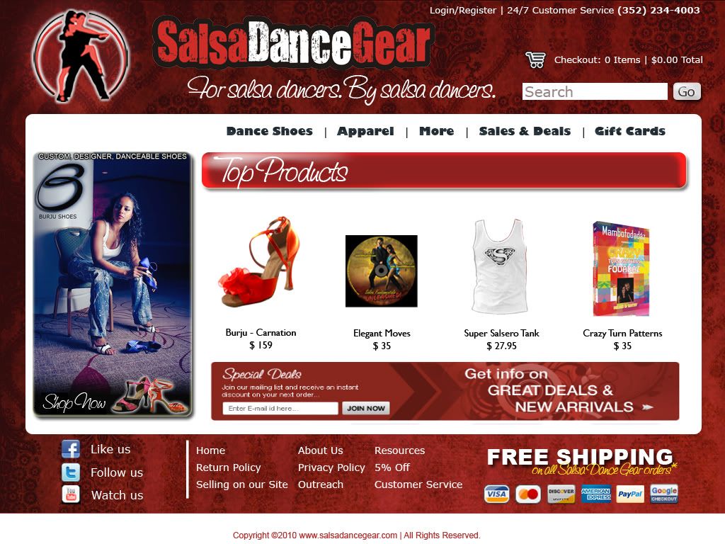
thanks everyone for the great feedback, im not a very good designer so this is really a great education for me! take a look at this new mockup and let me know if this takes into account some of your feedback. Please disregard the ghetto nature of my design, just pasted in the background for testing and everything hasn't been smoothed over, and the right side banner is simply a placeholder.
- attentionspan0
Slightly better - texture is all messed up needs to be less distracting.
There is some other details that need to be tweaked - go look for some inspiration see what other webshops do.In case you need grid get grid 960 - http://960.gs/
or just look up some other fluid grids :)
- what philosophy do you use to select a background texture? I'm just not sure how to make it less distracting without it just being a white backgroundcast7326
- ********0
Your client is in a niche market. They need to have their content and design be optimized for SEO. I would look at changing titles, h1's, etc etc.
- cast73260
<a href="http://s676.photobucket.com/albums/vv126/cast7326/?action=view¤t=homepageredesigned11-28-10.jpg" ><img src="http://i676.photobucket.com/albums/vv126/cast7326/homepageredesigned11-28-10.jpg" border="0" alt="Photobucket"></a>