Folio Crit
- Started
- Last post
- 15 Responses
- ********0
thanks very inspired
- Invalid0
you're terrible in bed, your breath smells like hot garbage and you got a face like smashed crab.
nice work though!
- akrok0
i think tweet and "like" makes it look cheap.
- ukit0
A lot of the work is pretty cool (I'm a sucker for infographics, data visualization and the like). The site itself though isn't doing you any favors. The layout (grid, type, margins) is lacking. Also this is just a personal preference, but I wonder if it wouldn't have more punch with a dark background.
- Thanks... i personally didnt like darker bg coz most of my work is on white bgs... i'll try it againbotbot
- shoto_can0
i also like the infographics, dont like the website
the copy it's undecided not well prioritised
- ********0
Did you actually design a signage system for Toronto and an info graphics piece for the NY Times? Or were these student projects that had nothing to do with the stated clients? I would make that clear if it is the latter.
- Andrew_D0
What's the fascination with Kensington Market? It's such a shit heap bar a few decent stores. A lot of nice work in there, though.
How was the York U program? I chose OCAD ultimately because of location, but had gotten into York as well.
Keep up the hustle!
- pinkfloyd0
I love your portfolio, but I think you're site looks too pc ish.
- d_rek0
great work!
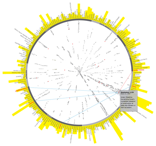
However, I would love to see more detail views of the data visualizations. I think a few juicy details from some of those screens would make the overall presentation much more interesting.
- pinkfloyd0
I been looking at geometric patterns recently, and really like this
- hellojeehae0
sweet work. and agree the site doesn't do justice to what you do
- botbot0
Thanks everyone! Insightful feedback.. keep them coming :)