Diddy rips off Pentagram
- Started
- Last post
- 105 Responses
- dopepope0
I don't think it's a rip either in the truest sense. I don't think they were trying to get away with anything here, just mimic a style they thought was cool. You see it a lot actually. One logo mimics another logo on purpose. You saw it a lot in the raver days of the 90s. It's the same idea here. if, because it's an exact style copy, it's a rip, then yeah. But is it a rip in the sense that they thought no one would know where the original came from, then not a rip.
- akrok0
great, now just say it's a style and you can rip it.
- i don't think you can copyright letter shapes, something about communication / utility********
- font software is what is protected, not the shapes within i believe********
- blah. blah.akrok
- fact hurts? education and information both go a long way********
- say hello to my team of lawyers.akrok
- i'm sure diddy's would win vs pentagram********
- i don't think you can copyright letter shapes, something about communication / utility
- ********0
so is it a rip when a client wants you to make their site like their competitors and all you do is sit there and wonder to yourself... how do i not rip this? your client told you what to do, your moral dilemmas are preventing them getting what they want all the while the site wide banner image is there, the different but god awful similar corporate blue logo to the upper left, the all caps sans serif font staring back at you, with a light gray footer on the bottom? but you go to sleep easily that night because even though they look similar, you know you didn't just copy the source code, it's your unique creation.... that looks just like 1000's of other sites.
- it stays********
- not the same.akrok
- get a backbonedoesnotexist
- it stays
- ********0
Question is who did pentagram rip off
- http://www.qbn.com/t…********
- Kevin Bacon!Douglas
- GO BACON!akrok
- http://www.qbn.com/t…
- akrok0
i bet they didn't even buy the font.
- CALLES0
leave diddy alone
- prophet0
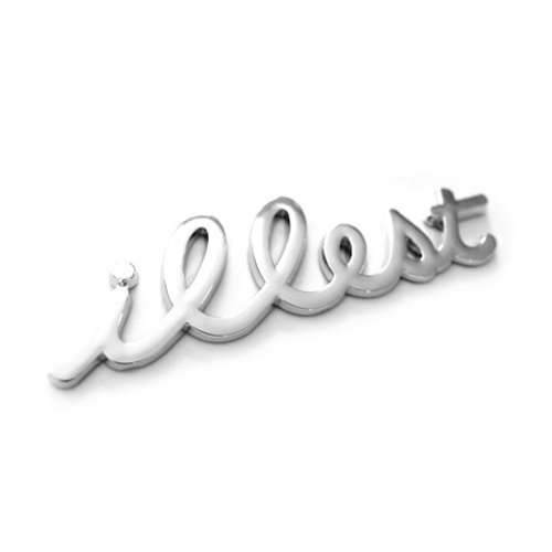
- is that a mazda illest.akrok
- http://fatlace.3dcar…prophet
- http://www.ashwellgo…prophet
- haha. looks nice, until they used "outlined". aaaaaaarh.akrok
- dyspl0
newoe, is this the image you see?

not a rip??- i see it..hellojeehae
- so clear it's a rip.hellojeehae
- yo! s'up?akrok
- mcmillions0
has anybody considered that the sean john shirt might have been designed first, and somebody at pentagram caught wind of the design and ripped it for the poster? i, for one, am convinced of this.
- LOL!akrok
- no way, jose.akrok
- i am sure they saw the poster and went, that's would be awesome on a shirt.akrok
- think about it. it clearly looks better saying "Sean John" than "Seduction"mcmillions
- and the poster designer made up for that by adding a bunch of small type underneathmcmillions
- the poster designer didn't add the type, says so on his portfolio********
- akrok0
only way to settle it, show the vector file and what date and time it was created.
- ********0
one says sean john, the other seduction, i see it and as they are different, so they can not be the same, therefore is not a rip, but as i have said before heavily influenced, yes. rip as in to steal or take. does this designer get no credit for making new letters and building from something they liked?
did you know helvetica is a rip? or do you just not care?
"Haas set out to design a new sans-serif typeface that could compete with the successful Akzidenz-Grotesk in the Swiss market"
and fuck me do they look similar
so only one person can make anything of a particular style?
- ********0
the Haas Foundry used it (Akzidenz-Grotesk by the H. Berthold AG type foundry released in 1898) as a model for the typeface Neue Haas Grotesk, released in 1957 and renamed Helvetica in 1960
- okay but the poster and shirt graphics are more than just typefaces.hellojeehae
- but alas, it (Helvetica) stays as well doesn't it?********
- and then?mcmillions
- no.. not according to GAPhellojeehae
- lol @hello********
- hellojeehae0
....^ (response to neowe)
- ********0
not in this case, they are letterforms, which as stated earlier are not protected by copyright due to their utilitarian (communication) use


