Surfrider digs a rail
- Started
- Last post
- 32 Responses
- HijoDMaite0
noooooo!!
- i_monk0
SUR FRIDER
- utopian0
Looks like another istockphoto.com clip art logo. Could be just me, though.
- IT IS JUST YOU :DContinuity
- Meanie. ¬_¬utopian
- you guys are cuteidentity
- :-*identity
- Awww, thanks.Continuity
- inkpink0
just another generic x-culture logo.
when 90's "counter culture" brands like DC, Element etc. originally created their logos, they were ironic nods back to corporate design of the 70s and 80s.
it simply doesn't work now.
- Continuity0
It looks to me like they were trying to go after the feel of The North Face logo. Could be just me, though.
- gramme0
Most people who work in the surf industry have a bros-before-pros approach to business. It's totally inbred.
- "bros-before-pros"
- LOLutopian - HAAHAHA!HijoDMaite
- loldMullins
- "bros-before-pros"
- Countryman0
bad craft in southern california strikes again.
- non0
Type is fine. Mark is fugly.
- Countryman0
WHY!!!!!!!!!!!!!!
- detritus0
Sur Frider.
- gramme0
The old symbol didn't reproduce well @ small sizes, and the logotype was nasty. But if they had simplified/refined the old wave and dressed up the type, that would've been a far better solution.
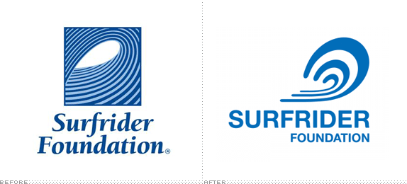
I'm half tempted to play around with refining the old logo and just sending it to the CEO for the heck of it.
- plash0
i like the old one better
- Yeah, the new one has no soul whatsoever.gramme
- I like the increasing stroke on the type. err.. l like the concept.plash
- EAR CANAL FOUNDATIONmetal_leg_will