MAMMOTH logo crit
- Started
- Last post
- 22 Responses
- Gizz0
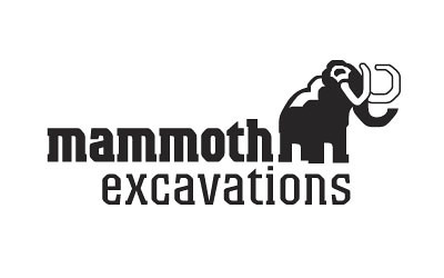
I liked that you copy'd the font like into the mammoth. I only don't get the white spaces within his (mommoth) back and head. Why not full black?
- ali0
I put the highlight in so that his ear had definition and he didn't look like a blob it also gives the impression of snow but I would probably prefer it all black.
- sublocked0
I think either go full outline on the mammoth body, or full black like Gizz said. Could be more blocky like the font. His trunk and back in particular.
- ali0
@Miesfan
Yes, I tried to make the lines thick enough to allow for a small size, originally I used a side on profile to keep it all black but the client was adamant about using this angle.
- ali0
@sublocked
I'll give it another go in the full black, but it was hard getting it to this stylised point as my friend originally wanted to use a photograph for the logo.
I liked the simple look of the one above but he really wanted to have some character and look 'staunch'
- robulation0
A photograph... of a mammoth?
- lolGizz
- http://www.google.nl…Gizz
- Ha, I was only being REALLY annoyingrobulation
- hawkwah0
It kinda looks like the legs and the tusks are trying to be 'm' + 'e' . ha.
- hawkwah0
Take a chunk out of the mammoths back.
- Projectile0
^^ yeah i was gonna say... why not make the mammoth look more M-like? would make it a nice standalone emblem without much compromise.
...and seeing as it's all about brute strength.. have you tried caps?
- gunpowderplot0
Been done before :)
http://www.google.com/images?pws…- Why write Mammoth and have a picture of a mammoth... It seem a bit obvious is allgunpowderplot
- Hombre_Lobo0
I think the mammut logo is my favourite mammoth logo -
I like your design though. But the mark could be stylised to
match the text a little better. I also like the White detailing in the mammoth, fill black wouldn't look as nice. Bur the White detail could be tweaked slightly, it's a bit unclear at the mo.Also I too would hve suggested capitals for the text had I not seen your design, but I really like the lower case. It looks strong enough to me, upper case may be a bit overkill.
What font is it? I like it! And I used to work in an outdoor retailer designing stuff so I've seen my fair share of outdoor/snowy logos. Good work :)
- CyBrain0
I freelanced for these guys for a while.
http://mammothnyc.com- nice.
high fps flash sites to me, will always be awesome.Hombre_Lobo - Nice logoali
- nice.
- Peter0
Why did the Mammoths go instinct?
There were no Daddoths.
...this joke works so much better in Swedish...
- dbloc0
- rly?
im not a fan.Hombre_Lobo - ya, Basquiat crown much?wankerbez
- S A M Otraut
- SAMO mamo********
- rly?
- ali0
@ Hombre_Lobo
Font is Colossalis
- ********0
- HAHAHAHA
fucking amazing!Hombre_Lobo - haha classic!ali
- So many amazing bits. The eyes. The tattoo. The smile. The impossibly huge right arm********
- HAHAHAHA


