Label Design help!
- Started
- Last post
- 8 Responses
- monospaced0
I did work with Coca-Cola on a lot of their contour bottles, and they actually prefer you send them the artwork as you would like to see it and not make you waste your time trying to adjust for the distortion. They (bottlers/printers) are the ones that make it work best, since it's their labeling process and they know what to account for.
- monospaced0
I was junior designer/production artist on these awhile back. Learned a lot about distortion on these shapes. I guess we did a little tweaking, now that I think about it. These feature a transparent substrate over aluminum.
- detritus0
"bottleneck label".
As d_rek and MrT say - just get crafty with a scalpel, strips of paper, a pencil a bottle and a prittstick. Rinse, repeat, then refine to computer.
Have fun!
- In your case, you'll probably end up with a curve - the 2d label you expect in Illy will sag in the middle, like a smiledetritus
- d_rek0
the only distortion is the perceptual effect of the label being wrapped around the neck of the bottle. Your artwork will not be affected...
1) Is the neck tapered? Straight? Funky crazy shape?
2) Do you have a sample of the bottle?
3) Do you have dimensions / die-line from the label-printer?
4) If you have all the relevant info above why not just run some tests from an office printer, slice 'em up and put them on the bottle with some non-permanent fixative?
- Miguex0
Wooah
I didn't know there was deformation on this process, then again the one time I did labels was for soap bars and the box was straight.
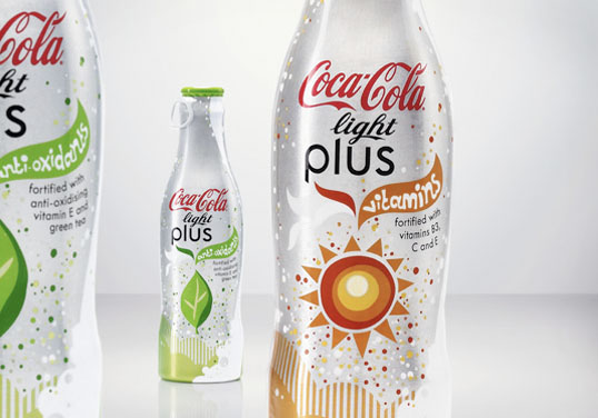
- Miguex0
On these wraps, it almost looks like there is distortion to me, I don't really know for a fact..

Are these the kind of labels you are talking about?
The bottle looks pretty curvy too
- Miguex0
sorry bad link:

- d_rek0
I did labels for a couple of different types of wine bottles and I know personally the best way to go is to test on the bottle. They each had a different taper so I had to adjust the labels ever so slightly so they appeared perfectly 'parallel' to the edges of the bottle. It was a little tricky, but after a little trial and error they came out great.
We didn't label the necks however - they were foiled with the wineries logo stamped into them.