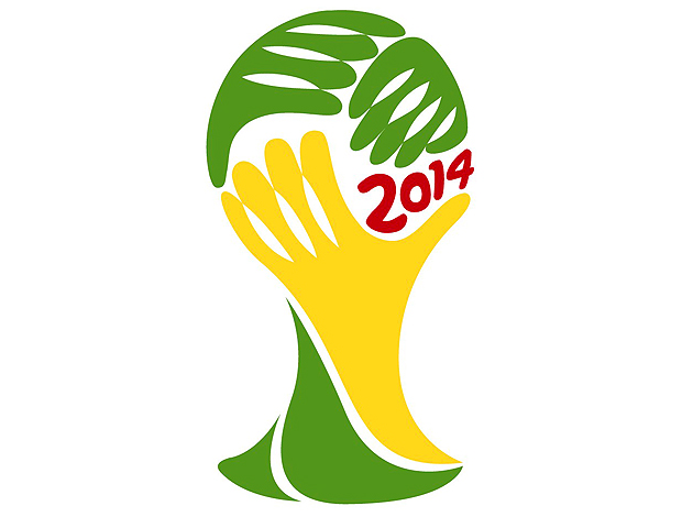
Brazil 2014 World Cup logo
- Started
- Last post
- 44 Responses
- pressplay0
I like how it doesn‘t suck completely... remember this pile of trash?
http://forza_azzurri.homestead.c…...
- pressplay0
this:

- these are not the droids you are looking for.invisiblechamber
- schadepizzafire
- monospaced0
I'm going to pretend I didn't see all those comments bashing this logo because my first reaction is that it's really effective. It's organic and symbolic and full of energy, heritage and sport. I like the way it looks; it's visually appealing. The hand-drawn type reminds me of someone painting their address on a wall, or an illustrative tropical style. I disagree with anyone calling "LiveTrace" on this, because it's too consistent and planned to be anything else than intended (in my opinion). Carry on.
- faxion0


- those look like stamps... I'm really digging Italia '90monospaced
- ********0

- ejectstudio0
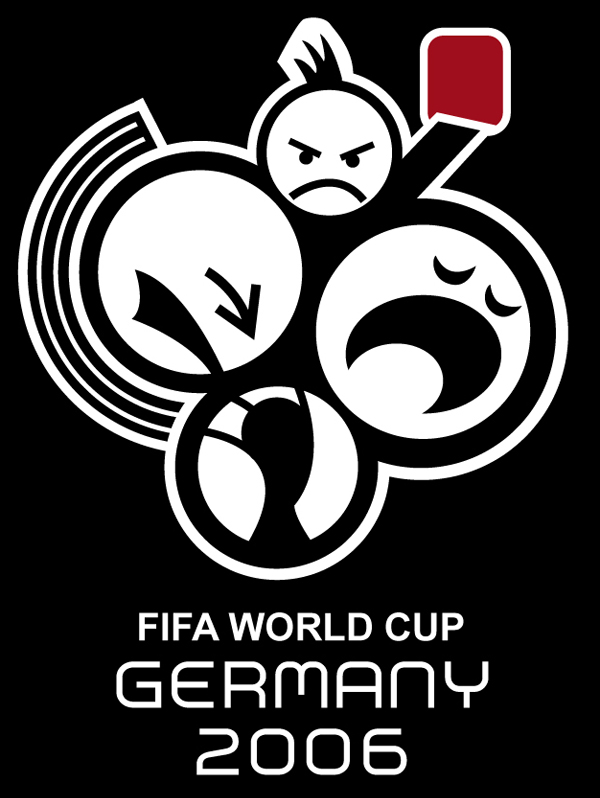
France 98 was a shocker! interesting how the Argentina football graphic was copied by Spain, and Mexico copied spain. The Brazil logo is shite, really clunky, fat ill considered shapes...
- faxion0
Last but not least

- monospaced0
I just traced it quickly with the pen. I like this logo more now.

You can have the .ai file for fun (it's not perfect by any means): http://www.benwexlar.com/downloa…
- hektor9110
we should all come up with our own logo and print some tees
- SoulFly0
hey don't forgot this one:

- faxion0
World Cup Willy anyone?

- Bullitt0
Its a great logo, The world in brazils hands.
Some of you on here do talk some shite. Go back to school and learn Graphic Design. :)
- dasmeteor0
Good idea but poorly executed. In the mean time I would like see it in context.
- dasmeteor0
Context bump
- SoulFly0
HATERS WILL HATE
- Miguex0
come on, there is nothing THAT BAD about this