logo crit
- Started
- Last post
- 18 Responses
- trooperbill

anyone care to give advice?
- diet0
Con...text...
- trooperbill0
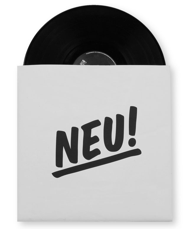
its for my portfolio... neue.co.uk wanted something hand scripted but my handwriting sucks! has to feel up beat, positive
thanks
- OSFA0
- identity0
reminds me of:

- bigtrickagain0
it looks nice in isolation - though i don't see it matching with your current website (which is very 90-degree-angles and blocks of color and text), if you redesign it to fit the logo, it could look great.
<unsolicited site crit>
your current site is kind of... busy. it's hard to tell the nav from the content - it all blends together. maybe if you are doing a site redesign soon, think about more white space and framing for your images?
</unsolicited site crit>
- powershot0
rip
- trooperbill0
yeah the site sucks at the moment, im going to make it more 'corporate' and try and push some clients through. its currently being donated to a developer friend who needs extra work and it ranks for web design leeds which is nice.
thanks for the site crit tho :)
- ********0
Those letterforms are atrocious, IMHO.
You should run with something like iVillage, if you're looking for "friendly" and "accessible".

- im finding the double e a bit of an issue :/trooperbill
- i think this a tiny bit too kiddish. i like Veer better http://ideas.veer.co…********
- Yah, I agree. I just wanted to show something with some personality is all.********
- suuuure. seems like you have trouble taking criticism.********
- ...im so cute.********
- ********0
its alright. but i bet there are a lot of better handwritten fonts in that style. look around.
looks more like the old glade logo:

- OSFA0
I've always liked this style...
- trooperbill0
AARGH designing something for myself is a bitch! im constantly second guessing myself all the time.
- then make your logo an animated gif that changes into 50 different fonts. it'll be dynamic.********
- then make your logo an animated gif that changes into 50 different fonts. it'll be dynamic.
- rodzilla0
http://www.impallari.com/lobster…
worth a look
- trooperbill0
bump for lunch time
- bumdrizzle0

etc.
nice shape though.
N e are a little close.
- pressplay0
I like it... although the name "Neue" sounds strange to me... why did you choose it?
- gfyneue75_bold
- :Ppressplay
- :)neue75_bold
- its german for NEW i was part of neue.dr tDR group :)trooperbill
- yeah, I know, I am german, but "new" would be "neu"... "neue" is a declensed form, so it feels there is a reference missigpressplay
- Projectile0
it bothers me that the line thickness in that font is constant. give iit some character
- i_monk0
The stroke is too uniform, and the U's tail is so close to the second E it should either connect or be cut back, I think.
- Jordy0
For a SEO your site is painfully slow ..
sorry unrelated to logo..