looking for a font - the quick and the dead
looking for a font - the quick and the dead
- Started
- Last post
- 8 Responses
- cyc2222
looking for the font used here and throughout the book:
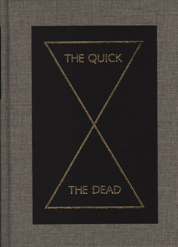
it has a strange Q and W, the W has sort of crossed lines in the middle.
any ideas?
- monospaced0
What W?
- how do you not see it?7point34
- It actually looks a lot like Gotham, but it's not exactly it.monospaced
- hans_glib0
you mean kabel?
http://new.myfonts.com/fonts/ado…- close, but not exactly it, but that's a good start, thankscyc2222
- the C is wider in the image than it is in Kabel...close...but not quitemonospaced
- and the K is differentcyc2222
- cyc22220
It's not there in the picture, but it characterizes the font...
looks alot like corinthian.
- johndiggity0
close to nexus sans but not a match. let's see some more images.
- monospaced0
So frustrating. The N feels like Futura. This is a unique typeface.
- cyc22220
http://superserious.net/work40.h…
he did it himself.
- looks almost identical to gill sans, or johnston7point34
- except for the Wmonospaced
- monospaced0
Aha! Then it is kind of a mix between Futura, Gotham, Nexus and Kabel.