Football Badge Crit
- Started
- Last post
- 15 Responses
- WhiteFace
Something a bit different, I'm designing a badge for my brother-in-law's new football team.
What do you think so far...

- flashbender0
Is the aqueduct at the bottom a nod to their water/spa history?
- PPirate0
I like it
- liveforever0
looks really good mate
- WhiteFace0
the top is more a nod to the spa history it's based on the top of the royal pump rooms...
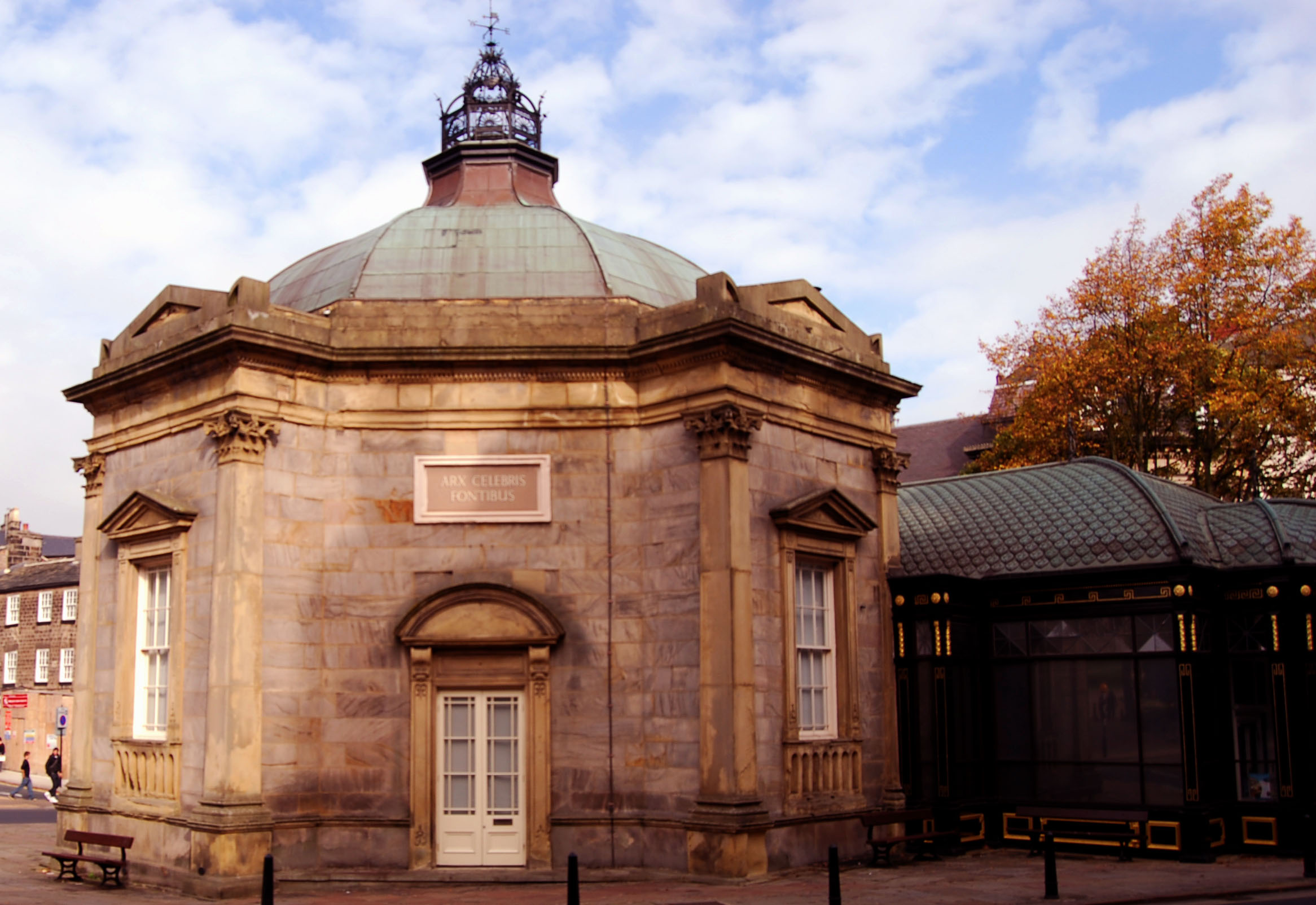
Viaducts are a quite a prominent site around here so I thought it was quite fitting...

- Nairn0
K, reduce that to, like 100 pixels or something, to force the details out and to feign web use and (to a wee degree) how it will look stitched.
I imagine you'll lose the seams on the ball, the weather vain, the outline around the banner and possibly even a lot of the 'est 2009' text.
There's a lot of room wasted - especially above the banner and below the (I assume) Stand. If I were you, I'd have it so the ball detail sat over the top of the banner and a bit more of the Stand. Fill into the spare areas a bit more and you can increase the stroke & detail sizes so they don't get lost at lower res renditions.
Good start though - cries out to heritage n'all that, and mixes old and modern better than a lot of already official ones. Just needs a little more love and play.
- Nairn0
I'd start by removing everything that currently looks like a single pt stroke.
- WhiteFace0
gjd - I chose the colours, I'm not sure about them either. They have one green kit and one red/black?! Tried loads of different compilations and this one seemed to work the best.
Any suggestions?
- jimzyk0
This is nice whiteface, i like the construct of it.
The different elements work well together.
I'm not so sure about the colours either.
I like them, but for a football club, it seems a bit norwich-y... and they are a bit crap now, aren't they.I agree with naim about the weight of some of the strokes & elements, seem a bit spindley. May need to be heavier.
Would it be worth looking at highlighting one of the elements within your badge (ie, viaduct) and strip back the others, it may be worth looking at... like the ones below, these all have one key element.
Although, i do like how yours is coming together, may be just worth having a look!


- ********0
Like it
- rodzilla0
Nairn brought up a couple really good points that I wanted to expound on. Typically when we do embroidery on our hats, if the graphic is at 100% we try to keep our font size at no less than 18pt or .15" high. The thicker the font the better.
Also on your font did you try "skew" within Type_Type on a path, might make your FC Harrogate flow better.
- WeLoveNoise0
come on u villians
- baseline_shift0
Try losing the scrolly banner thing. Its creating awkward spaces in the yellow field. This will allow you to bulk up that text to fill the space out.
That and making some of the line weights heavier you should be good.
And i like the colors