76ers
- Started
- Last post
- 9 Responses
- ********
discuss
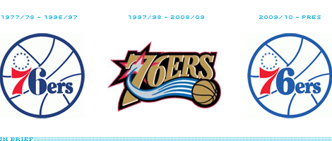
- neue75_bold0
the "7" doesn't belong, but overall, it's a nice digression...
- ********0
do you think other teams will follow with this?
- Andy_ssw0
almost prefer the OG version. Better all round really. pardon the pun.
- ********0
duhhhh... i thought this thread was about people born year 1976
- kerraaang0
Why change the 6 but not the 7? I think they are on the right path, logo from 2008/09 was bad.
- calcium0
Almost every other promotional material at the games the past year have been using the new logo. They even were placing it on billboards and on signage inside. My girlfriend and I kept saying how we wanted it to go back to that so badly. I can finally get myself a jersey I like now too without having to go to Mitchell & Ness.
The 97-09 logo was awful, silly, and not representative of one of the more storied franchises in the league.
Philadelphia had a lot of great brand equities with their teams in the past and a lot of people prefer the old versions more. I wish the Phillies did a fat P night for the fans who remember baseball before Ryan Howard.

- link not worky********
- agreed. I want the eagles to go back to kelly green and white SOOO bad.baseline_shift
- link not worky
- CALLES0
i would like to know how much they paid the designer to digress... cuz i'm sure someone got paid for this
- calcium0
Probably the redesign of all the materials.
- CygnusZero40
Love it. Anything old school works for me in a sport like the nba.
- The design itself isnt great, but its just that old nba look that im fine with.CygnusZero4