Baskin Robbins redesign
- Started
- Last post
- 16 Responses
- fooler2
Just drove by a Baskin Robbins and noticed they had a new logo. Still looks like crap, I prefer the original old timey western looking one they had years and years ago.
- fooler20
- thumbs down on the new designrayborn3000
- this has got to be a joke right?!??!zarkonite
- mg330
There's a 31 in there! I'll be!
- ********0
damn, this was a while ago
- emukid0
it makes the ice cream taste better. i like it
- airey0
isn't that 'new' redesign pretty old now? i'm not timelining here, just throught it was old and wondered where you live that they just rolled that out?
- designbot0
This makes me want ice cream now.
Pecan Praline....mmmm.
- ********0
makes me realize how much better dairy queen is
- fooler20
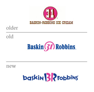
I just noticed a store redesign here in Portland, Oregon. Not sure how long it's been up but I pass the place frequent enough to know it hasn't been to long. I did a search and no one had mentioned the rebrand yet, there was a thread about the founder dying a year ago.
I guess it's working since I noticed it but still a pretty crappy generic logo. Didn't even notice it had the "31" in the logo at first.
- monospaced0
This happened at least 3 years ago.
- Amicus0
um.... do they still have 31 flavours?
and, why do they still look crap?
- fooler20
I guess it would take years and a ton of cash to change every existing sign.
- juhls0
I don't think I have ever seen one.
- instrmntl0
i hate it, but i bet if i was a little kid i would think it was way better than the first two old people ones.
- nikdaum0
Well, I don't like any of them personally. Middle one is the best though.