Font suggestions?
- Started
- Last post
- 12 Responses
- jimbojones0
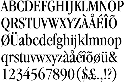
Scotch Roman. (the font)
- Scotch_Roman0
Don't use a condensed Garalde, they always look awkward imho. Their more organic construction doesn't translate very well when horizontally condensed. You'd be better off with a more rationalist construction. I'd recommend something like Chronicle.
http://typography.com/fonts/font…
- phatlee0
Bump
- jimbojones0
Beaufort by Nick Shinn
- pylon0
Cheltenham Condensed (serifs are a bit fatter, but not too bad)
Garamond Condensed
- pylon0
It has to be said: Clearface.
- jimbojones0
Swift, Borges Blanca
- jimbojones0
I am very tempted to say Clearface, but I will be misunderstood
- Hahaha, I was actually going ot suggest that as well, in all seriousness, jimbo.pylon
- it's a classic after all :) in all seriuosness ;)jimbojones
- ;)pylon
- hey, do you know a good script font?jimbojones
- Clearface innit?
What kind of script?pylon - http://www.qbn.com/t…jimbojones
- neue75_bold0
I'm also a big fan of Plantin

- Oooh I love this!! anymore??phatlee
- monocle fan?typist
- not really...neue75_bold
- uncle_helv0
Minion has quite a lot of weights, and fits the traditional bill...
- neue75_bold0
I'm a huge Garamond condensed fan...
- ayeMau
- apple ads of the 80'suncle_helv
- YESH!neue75_bold
- Nice!!! Cheers!!!phatlee
- eh, no. I hate condensed Garaldes. Now condensed Bodonis or Scotch Romans, not so bad imho.Scotch_Roman
- jimbojones0
Century condensed
- phatlee
I'm after a serifed font that has a condensed weight and looks traditional. Any thoughts?