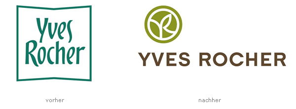
Yves Rocher Redesign
- Started
- Last post
- 31 Responses
- neue75_bold0
the R isn't handel, unless the slightly modified it... close though..
- ok ok 99% ;)
http://www.moamoa.or…Mau - it's also not either of the others so they're still cunts for forcing 3 fonts together...neue75_bold
- ok ok 99% ;)
- invisiblechamber0
i agree the typo is a bit ramshackle - but that knob is sweet!
- kezza_20
I think you're wrong on those 3 fonts...
- utopian0
looks fine to me
- jevad0
the Y and V together are a tough nut to crack with the right kerning. It's certainly not as hideous as you're all making out. I actually think it's a highly appropriate re-brand for them.
- neue75_bold0
the 'C' is fucking huge in comparison to the other letters,,,
If they fixed that, worked on the type a bit more and lost the icon/graphic, it'd be alright...
- dyspl0
the C doesn't bother me, but mmh kerning looks bad...
For once they didn't put any 2.0 shiny shit on, don't be too harsh :)
- kezza_20
thats nice, wtf are you all talking about.... the old one was shit
- liveforever0
explain why u think the C doesnt work - i'm curious cos cnt see it myself
i think the H is prob a little thin
- digdre0
don't like both.
- Mau
WTF
a poor mix between 3 fonts.
the C doesn´t really fit to the rest...
kerning.... awww