Magazine Spreads
- Started
- Last post
- 14 Responses
- thizzbobby
I'm currently working on my new portfolio site, and I want to use some magazine spreads I've done, but I don't have a camera, sad me.
I want the comps I'm going to do look really nice, and look as if they're in a magazine, instead of showing spreads standing alone in white space.
I was crawling through some portfolios here, and came across http://www.concrete.ca/concrete.… and I really like how they've handled their spreads for Azure magazine.
Now, I already did a little bit of looking around for a simple solution to this, such as maybe using Issuu, or Zinio to compile my comps into a PDF mag and grabbing screencaps from those, but they just flatten the pages with no underlying pages or nice shadows.
Any advice on this besides just drawing the shadows by hand, and editing in some pages in the background?
Thanks in advance.
- ********0
Do like this (Slide 03):
http://www.liquidagency.com/port…
- brandelec0
can you get your hands on a camera for a few days may be?
- I really wish I could. I'm kind of on a thin line right now as far as finances, and I just moved so I know no one here.thizzbobby
- thizzbobby0
Thanks GetRefresh, that's essentially what I'm going for, but looking at that link, I'm thinking that a couple a little design flairs here and there (like they did with the black female on the one spread) could really help my spreads not look so stodgy.
Thanks again!
- horton0
i don't think you're going to be able to fake an effect any better than what GetRefresh linked to without spending hours and hours on your images.
and at a certain point, time = money... which could equal a decent little point/shoot camera that would do the job.
unless there's some blank page templates out there?
- ********0
you can get blanks cheaply on istock, or expensively with LiveSurface.
Just a matter of a bit of masking and setting your blending mode to multiply. BOSH!
- The blanks on iStock are alright, but I really hate using iStock shite.thizzbobby
- If they are alright, who gives a shit? What a pointless thing to say.********
- I don't subscribe to the idea that using stock is "okay," I guess.thizzbobby
- brandelec0
i agree with horton, i'd even return the point/shoot afterwards
here's a photoshop tut to get you started may be:
http://www.webdesign.org/web/pho…
- ********0
shooting will be hard pressed to look as good as the Liquid example.
- thizzbobby0
Thanks guys, you're great. I've gone ahead and taken GetRefresh's advice and mimicked a look similar to the one he linked. Just made the elements from scratch, and it's looking pretty decent so far. Setting up the overlays and shadows on their own layers will make slapping all my spreads together pretty easy. :)
- thizzbobby0
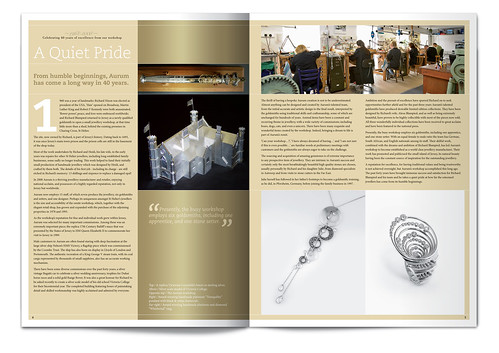
Does this look legitimate?

- horton0
looks pretty good to me..
if you wanna fuss with it maybe a little offset/roll into the gutter, so that the horizontal lines aren't dead straight and inline.
and/or maybe a little blur in the gutter, center line looks hard... in a real photo that might be out of depth/ focus.
- Right on, thanks.thizzbobby
- you could probably play-up any highlights/ shadows too... i don't really notice themhorton
- thats just my 2 cents.. since you asked for feedback. nice work.horton
- thizzbobby0
Thanks horton, here's what it looks like without the lighting/gradient effects over top of the spreads.

I'll probably leave THIS spread how it is at the moment, only because I want it to be as easy as possible to drag and drop each spread into this PSD file, and not have to tweak stuff, but then again, it might benefit certain ones to do what you're saying.
- inhaler970
For me the shadow looks a bit too soft. What about asking a friend or a relative with a camera? (Don't mean to sound like a douche, just seems like a good option, and you get to be social for a little bit)
- I just moved to a new state, so I don't know anyone here yet. Thanks though.thizzbobby
- JerseyRaindog0
Here's one I put together recently. I think you can afford to be more dramatic with your shadows.
- And maybe add a light gradiated white strip like I have just to emphasise where the light catches.JerseyRaindog
- yup i'd agree re. shadows and highlights... make it pophorton
- fiver0
but is making a fake that looks fake worth it? why not just place a flat file if it's obviously digital anyway? just curious because i'm dealing with the same issue.....
- I think it's worth it, if you want to present a refined look instead of two images side-by-side.thizzbobby
- The spreads are in fact printed, in a magazine, just don't have a camera, so to me it's worth the effort.thizzbobby
- mine are printed as well, but i can't get a decent shot because of lighting. just wondering.fiver
- guess the presentation looks better, so therefore worth the time...fiver
- Exactly.thizzbobby