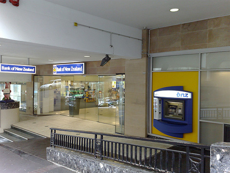
bnz redesign
- Started
- Last post
- 20 Responses
- coldy0
Kris Sowersby designed the custom typeface Serrano for them,
http://www.klim.co.nz/custom_ser…
hes an excellent type designer btw, check out his other work.they based the logo on this face, but did a little barstading of it I think. You'll notice the letters dont match etc.
If youve got a spare couple of hours you can read through this typophile thread on the typeface, where type nuts talk extensively about counter spaces, ascenders etc etc.... http://typophile.com/node/50053
- anxiousarms0
does it really bother you that much?
- Renegade0
Does the bank sell toys, make ice cream or financial transactions?
- for every £10 u put in
£1 go towards an min on the roundaboutWeLoveNoise
- for every £10 u put in
- doesnotexist0
looks childish and too playful
- Josev0
yeah, I'm kind of bothered by the space between the b and the nz. If that was intentional (and I think it was) they should have gone further with that idea. It kind of creates an awkward tension as it stands.
- moamoa0
I know I know they wanted to symbolise the nz as NEW ZEALAND, but it could be much better.
- ukit0
THIS IS SERIOUS

- WeLoveNoise0
whats wrong with having gradients on a corporate mark ?
- Point50
took me some time, but I revised this for us HHAHAHA
- HAHHAHHHAHmoamoa
- Just couldn't resist applying a reflection could ya :-)Sandman_1982
- Bluejam0
zuq!
- mimeartist_com0
I liked the abbey one so go figure :) I don't like how Santander have made Abbey look now :(

- mimeartist_com0
makes sense to me, and the curve follows the base of the z, and the tail on the b helps promote that
- blackspade0
they needed the update, the orig feels so oldskool
- moamoa0
if they decide to take a simple type solution it has to be perfect.
this area sucks

- OSFA0
Not bad. At least they didn't go with the typical 'corporate' bullshit ideas... (rant)
- Point50
I have to agree, I'm not too sure about that connector between the n and the z. now that I look at it, I don't like the little tail on the b either. honestly, this mark looks a bit juvenile, not like a corporation or banking institution.
- svenreed0
Could the reason for the nz be because its the Bank of New Zealand, and not Bank New Zealand, or something like that. If im making any sense at all let me know haha.
Nice though, little cutesy...
- OhYeah0
Don't mind it at all, better than the old one for once. Maybe if the "b" was closer to the "nz"?
- ukit0
Looks like it was left out in the rain a little too long
- digdre0
not bad, is it?
- its not bad, but the nz curve sucksmoamoa
- theres got to be a reason for that curveWeLoveNoise
- I like it but I can't help feel that the right part of the 'n' and the 'z' should be slightly lower to balance it better.Sandman_1982
- moamoa
simple type solution but wtf happend with the nz?
(I don´t talk about gradients anymore, otherwise I will get a heart attack)