Pepsi rebrand?
- Started
- Last post
- 82 Responses
- ********0


Pepsi has announced that they are undergoing a drastic relaunching of their branding and packaging to bring "new life" to their flagship brands. The most dramatic element is a redesign of the Pepsi Globe logo, which for some reason is now supposed to represent a smile.
"Pepsi’s Chief Marketing Officer Dave Burwick set the tone for the change at a meeting of Pepsi bottlers when he said “If we don’t change quickly, we run the risk of being a footnote to history,” according to Beverage Digest.
PepsiCo Chief Executive Officer Indra Nooyi told BD she didn’t expect the changes to immediately stop the decline of Pepsi CSDs in the face of a difficult economy, but she expects the initiative to slow the decline until it eventually flattens out.
BD also reported that the changes generally excited bottlers, and that Frank Cooper, vice president of sparkling brands, promised to help bottlers convert their fleet to display the new Pepsi Imagery, which is due to hit the market late this year or in early 2009." via BevNet.
What are they thinking? Seriously, this is a big step backwards in my opinion. With the change to the classic Pepsi globle logo, it looks like a cheap knockoff brand. I don't get it, just how is this supposed to increase or even sustain sales in a dwindling economy?
- what have they done to MOuntain Dew?!?!locustsloth
- lost some vwls?janne76
- janne760
just following the coca-cola subbrand ipsei's design?

- ukit0
- ********0
I think all but the mountain dew look more gooder than before, especially the sierra mist. They are very aerodynamic feeling so you can drink it faster
- ninjasavant0
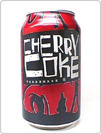
It looks 20 years old before its even released. Rebrand if you must but at least don't make it suck. It doesn't matter anyway, no one will ever top the old cherry coke for soda branding
- dog_opus0
I like it.
- nearestexit0
it reminds me of the obama logo


- Geith0
god awful. looks like a tampon logo.
- joeth0
I really think these all look like ass. But I'll wait and see how it looks on the shelf. That's what really matters.
I know that it for sure won't look as clean as this when they get all the other nutrition info and marketing crap on there. Everyone wants there brand to be clean like Apple. But only Apple knows how to pull that off. The copycats all starts out clean, and then it all goes to hell when the marketing people get their hands on it.
- Gifto0
It looks like they chucked together the actual can designs at the last minute — and what's up with that hideous kink on the 'e'? Shite.
- The kink in the e refers to the old Pepsi logo. Because - probably - they were uncertain we might forget it.eating_tv
- I think the kinky e is the best thing on the can : /mikotondria3
- eating_tv0
Oh -god- it's real. I thought for a breeze that it was a hoax. But my lord it's -real- as if we're seeing the moon crash into the earth itself on Live TV. How hideous. Godawful, terribly bad. Who's the consultant? Who are the executive designers? Who - for the love of PETE - are the ones responsible for this terrible oversight in taste, in taste for design triumph. The, the, the... feel with the public? The in-crowd, so to speak. Why the -hell- did they make it look like the bottle's melting and the label's from some trendy-my-ass mineral water? Jebus on a stick! This pisses me off!
- SigDesign0
One thing I do actually like about the new Pepsi logo is how they can alter it for Diet and Max, etc... it's interesting... Mountain Dew looks awful...