Logo help
- Started
- Last post
- 38 Responses
- moamoa0
.
- moamoa0
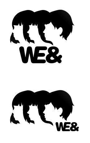
the bottom curve of the e and teh ampersand should be equal or totally different, there is a good reason why every font has his own ampersand.
so in my opinion: keep the style of the font, or make a complete contrast with the ampersand (example: didot italc)

- kodap0
thanks for the input and help so far, much appreciated
- kodap0
I'll definitely drop the eyes and re-work on the ampersand, But it has to stand stronger than just a family of we
- ********0
Not really any relationship between the wordmark and the symbol...
- Knuckleberry0
cut the gradient in the hair, make it all black. or Pantone cool gray 11
- Tark0
a makes me think winnebago for a second.
- gentleman0
it might be worth you playing with sizes/balance or even a wee bit of colour - make it more like a word mark and less like you've just typed it or worse - trying to mash weird fonts together.

note: fonts not necessarity right - but worth playing with scale.
- d_rek0
FAIL on the images you previously posted.
From what i've seen from other users the type isn't strong enough to stand on it's own.
- gentleman0
i like you derek,
you shoot from the hip and you don't let the lack of finesse in your own work stand in the way of making a subjective decision
good on you
- is this supposed to be a personal attack? fail.d_rek
- and why is it that people who don't have work to show always attack others? hmmm....d_rek
- i have work to showgentleman
- and?d_rek
- i don't know..
you brought it up.gentleman - That's what I thought. You're pretty worthless gentleman, even as a troll. At least most trolls provide slight amusement.d_rek
- amusement. You can't even do that.d_rek
- a troll eh?gentleman
- i fail at amusement eh?gentleman
- that's a valid commentgentleman
- you can't win at everything i guessgentleman
- Hey gentleman - is that seriously your site? There's too much content for it to be a joke... Im so confused.********
- a joke eh? :Dgentleman
- i'd like to think what i do makes a small section of people happy and what i dont do is a loss for humankind...gentleman
- Your work makes me happy. :)********
- jimzyk0
i wish i could help, but i cant... i just cant...
may the force be with you kodap.
- gentleman0
the force eh?
- gentleman0
so - where's the final logo?
- gentleman0
did you round your own font?
- gentleman0
also why are they facing backwards? and why wings? and why does the end of the 'e' look fudged?
also space it out a bit..
and websites locked up with logotypes look nasty.