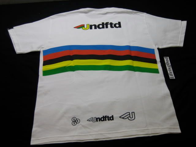
what teh font?
- Started
- Last post
- 10 Responses
- MLP
this is embarrassing, but i've run through everything i can think of...

- BaskerviIle0
Looks distinctly Avenir-esque to me
- airey0
that 'c' looks like it should be easy to pick (pfft. snigger).
- BaskerviIle0
on a side note, I read it as 'inelli', pretty crappy that you don't read the C first
- kelpie0
I reckon "no where near" is a bit harsh 2cents

think you might be right though, close but no cigar
- thanks kelpie, I know my type and at a glance I thought avenir was pretty close, which it is!BaskerviIle
- It depends on how close you look at the details. The "n" and the "e" look nothing like Avenir.2cents
- kelpie0
although if you chopped the double L down a bit, moved the dots down a bit and did some horrid squeezing to the e, you might be there
- MLP0
yeah it's been ripped many a time, most recently by people that don't even ride bikes..
- MLP0
i think avennir is close enough for what i need
- kelpie0
the "custom" avenir version:

- Dancer0
On another sidenote. the dot on the "i" looks as if it is about to drop off.
What a crap logo.Avenir is a good call though
- johndiggity0
give century gothic a shot also, but this is probably hand drawn or based on a non-digitized face.
- yeah, hand drawn pretty poorly as well, hence the deformed e I reckonkelpie