speaking
- Started
- Last post
- 35 Responses
- utopian10
G
- _salisae_0
meant this one.
- IRNlun60
“
”
- Jaline0
primary: g, J, q, Q, S, &
secondary: a, k, p, r, t, 4
- _salisae_0
i wish you guys would show me. it would better describes what you see in those letters.
- spendogg0
S, S and s
- Soler0
$
- IRNlun60
http://en.wikipedia.org/wiki/Quo…
... quotations but just because I'm always fixing them in my code.
I am also a fan of the letter "X" which seems pretty plain but I like it because of its optical illusion.
- ADP0
I particularly like working with B and R for some reason.
Aside from typography speaking though ive always been drawn to 7 + G
- _salisae_0
i love what was done with these 8s
- Antonelli0
R, r, e
- MrOneHundred0
I’m all about the lower-case g.
- janne760
l is underrated.
l is the best.
not pretentious,straight up,
no bull..
- ismith0
Not my favorite, but when starting a design it seems the 's' is usually what makes or breaks a font choice.
- TeganTorch0
3, v, t, B, F, ?
- janne760
l
- Llyod0
FU
- _salisae_0
these gs are pretty spectacular
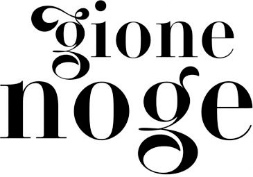
- < for mr. 100_salisae_
- They are rather nice. A little flowery, though. I’m more of a Franklin Gothic lower-case g guy.MrOneHundred
- Like utopian up there.MrOneHundred
- I love this.Jnr_Madison

