Symbol Crit/Input?
- Started
- Last post
- 43 Responses
- detritus
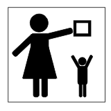
First thing - what does it represent? If you can work it out, which one works 'best' for you?

It's going to end up quite small, (hence wee preview) so please take bottom size in to consideration. Sadly, it doesn't translate to wee very ably at 72dpi, but hopefully you can get the idea.
Thanks!
Nairn/detritus/that twat
x
- capsize0
no overhead?
- Raniator0
don't reach for your luggage on the overhead shelf?
i got that from looking at 2.
however, it doesn't suggest to me not to do it while the train/aeroplane is moving...
- detritus0
Balls.
You're right - 3 to 7 are the same as the 'overhead luggage' symbol, aren't they?
Damn, I've seen those things subconsciously so many times, I guess they've just leaked in.
Balls.
- wunderbra0
one armed midgees are not allowed to reach out to unidentified hovering boxes in space?
- detritus0
Ok, A little context then.
Imagine seeing this not on the overhead luggage compartment in an aeroplane, but rather on a consumable item/package of some sort.
Though, perhaps, I already have the answer to the question I asked.
Back to the drawing board?
- ross0
is #1: "when youre fat and depressed dont forget to carry a huge coffee cup on a saucer above your head"
- detritus0
lol Ross, you cruel bastard!
- chossy0
"don't put things on shelves where children can grab it and it'll fuck them up"
5 and 6 are my faves.
- ross0
haha, i know its his arm but it looks like a uncle sized gut. and he looks all sad looking down at it. like, "what have i done to myself" and "thank god ive got this novelty coffee to take my mind off my body"
- oldelpaso0
no underwater bomb disarming
- wunderbra0
it's hard to depict a child without reference, like so:
maybe you could put a little teddybear in the other hand or something
- wunderbra0
like so

- detritus0
Yup, exactly, wunderbra - I thought I was being clever with the pudgy body and over-sized head - the size of the symbol's principal usage is pretty damn wee though, so I can't really have too much detail in there.
I'll give the teddy-bear a try - that's the way the consumerChem companies appear to do it.
Thanks for all your feedback, relevant or no!
- wunderbra0
icon/signage design: the most underrated design discipline ever.
- detritus0
Also, for legal reasons, I can't be too specific, which doesn't really help.
It's got to say "keep out of reach of children" without ..er.. actually saying 'Keep out of reach of children".
Perhaps that's a little too unreasonable a request. Maybe 'client' should give me some leeway here.
Fucking legals.
- wunderbra0
last tip:
perhaps not use an enclosing circle or border if at real small size; instead just the child and shelf and box and a red cross over it, that'll do best it seems.
- detritus0
icon/signage design: the most underrated design discipline ever.
wunderbra
(Oct 19 07, 07:45)Fo' Sho' - it's this icnonographic side of design that I actually quite enjoy - all the other bollock prettifying can go to hell for all I care.
- wunderbra0
it's even better to make the red X look like it was drawn by hand, to strengthen the contrast in shape and style. it must attract the eye anyway.
but yes, the current size is very wee!
