Logo Crit
- Started
- Last post
- 15 Responses
- abba_cadaver
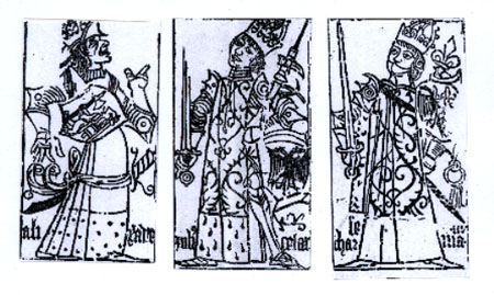
I have to integrate a few "joyous" people into a crown.

This is where I'm heading. Any ideas on how to make it not look so... cheap or any other suggestions
- doesnotexist0
looks very vintage bowling esque to me. your description sounds better than the logo looks.
maybe make it a tiny illustration with 3 actual people?
http://images.google.com/images?…
iunno where you're really trying to go with it.
- abba_cadaver0
I'm not sure where I'm going with it either, but I have to integrate those strange stylized people you see everywhere into a crown shape somehow.
- doesnotexist0
it's not working.
- abba_cadaver0
Yeah... I know
I was trying hard to convince myself it did.
- ********0
Westinghouse returns?
- abba_cadaver0
I can see that... but theirs works
- horton0
to start.. remove the circle.
- Nairn0
stumpier & curvier.
and as horton says - try it wihtout the circle.
- doesnotexist0
start refining just the lines there, without the circle.
- Geith0
it's fine as is. left one is best.
- cacoe0
It is working on a level... but it says insurance company to me. What exactly is the logo for?
- meok0
I like it.
- ********0
^
- tbgd0
Initially I liked 1 but now 2 is growing on me - A nice simple solution
- abba_cadaver0
With this client what they do now means very little in how the logo will look. We've tried to push them in a few different directions but it seems they want to use these elements to create a friendly icon that would fit just fine in the financial sector even though they are staffing.