New Quark logo and website
- Started
- Last post
- 34 Responses
- lustor0
i was hoping that they would make a product that worked again...
- Rand0
when the upgrade is lowered to 99 cents, will you go for it?
- eu770
awwwwwwww right - its a Q...
now it makes sense.
- graphito0
»i was hoping they would make their serial numbers and registration a little longer.«
LOL
- e_b_c0
that mark looks more like an 'a' than a 'Q'.
ungood.
- formlos0
Hahaha.. Thanks for posting this.. Viva la Quark.. :)
- GrammaSeff0
i was hoping they would make their serial numbers and registration a little longer.
because entering 45 case sensitive characters just isnt doing it for me anymore
- textbureau0
they need to change a lot more than the logo and site,
how about service/support for an application that a lot of folks really like.
- MLP0
yeah i've seen that everywhere, too. the site is pretty ugly though - all the duotones....
- chz0
its back up... and that icon is really a dime a dozen, i've seen a shitload of people using it and yes there are some font sets that have it.
- GrammaSeff0
they ripped derek
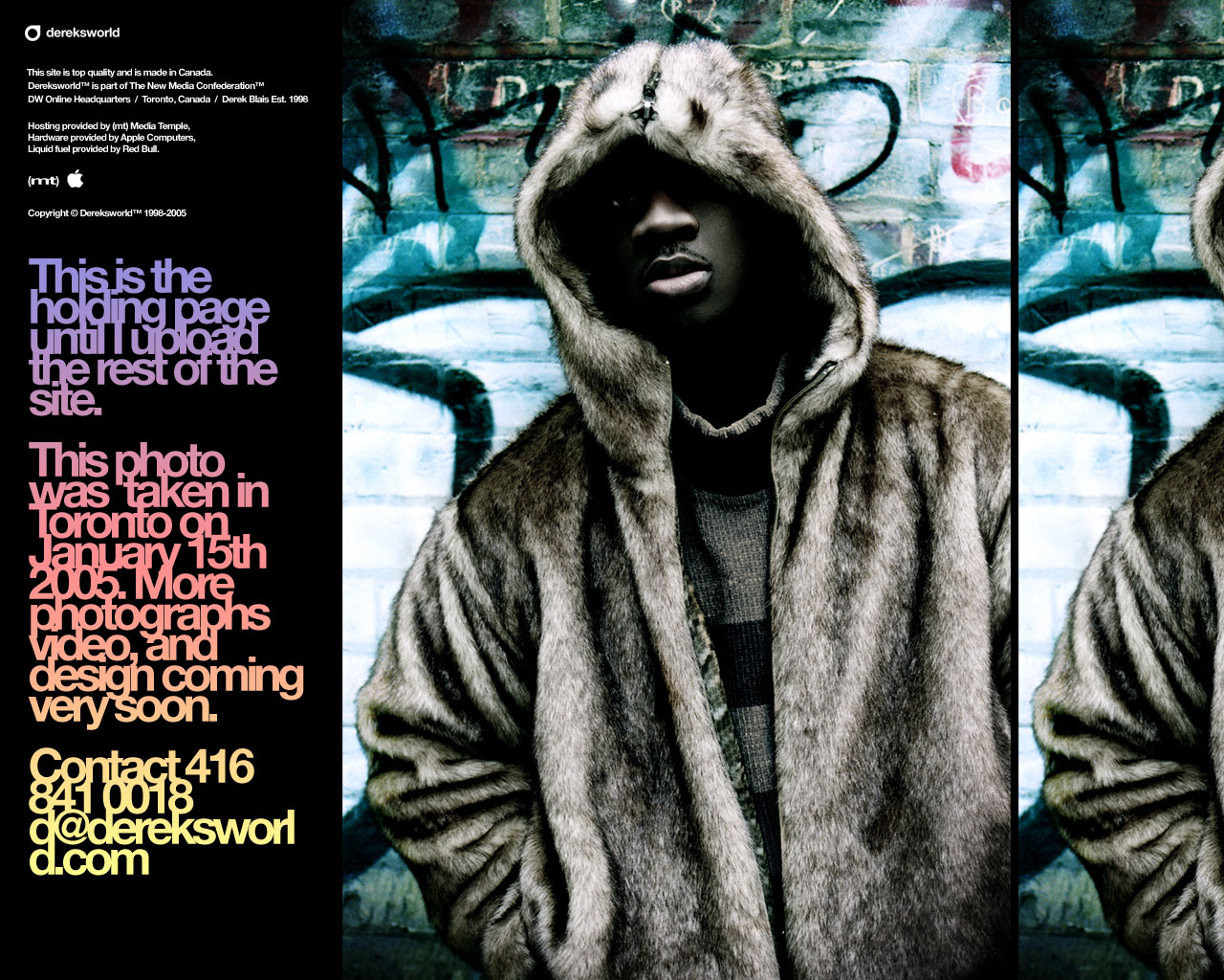
lol
- plusyes0
ah ah ah! marketing!
maybe they want to resume customers they lost after indesign and the shit version for osx!
- tny0
indeed, well trod
- exador1
hey...
any of you folks get a look at quark's new logo and website this morning?...the site is down right now the server is overloaded ithink...
but man..
that new logo..Derek..didn't you use the same graphic in your logo?...is that from some font package or something?..i know i've seen it before..either your logo, or somewhere else...i'm sure of it..
anyhow, when i saw quarks new logo i just about blew a mouthful of coffee through my nose...
