Can I get a crit?
- Started
- Last post
- 15 Responses
- nealjsb

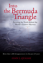
Preliminary cover design for a graphic novel I wrote. It's a Twilight Zone-ish story about a guy who falls through a rift in time after a trip through the Bermuda Triangle. The symbol at the bottom is Morse code for "SOS". The colors are meant to evoke darkness, the sea, "midnight."
Be cool, but by all means tell me if it sucks. I haven't sent it to my editor yet - I want outside opinions first.
- toastie0
change the type!! it looks like Arial or something.
- nealjsb0
The names are Univers, the title is Delta Jaeger. I can certainly change it, but I have a thing for Univers. Any specific problem with Delta Jaeger?
- Duane0
Random thoughts - it's late, but I'm honest when I'm sleepy. It seems like you could do so much more with it. I appreciate simplicity, but what differentiates this book from all the others on the shelf? Push the SOS/darkness/midnight concept and use dull and gloss UV varnishes on solid dark fields to give it more depth and a feeling of quality or value. I'd use Helvetica - it's more sophisticated and unbiased. The contents sound more interesting than the cover looks.
- toe_knee0
Get a designer to design it
- agentfour0
wouldnt buy it
- nealjsb0
Get a designer to design it
toe_knee(May 2 05, 22:05)
You're very amusing.
- Hym0
this for a graphic novel ??
looks more like the anual financial report of some boring company. If you're really after that corportate look you should still clean it up tho, a tittle on two lines bad, position of volume one bad, author names in big white bold italic bad, the rectangular square symbol thing bad.
or in short sucks, once again this for a graphic novel??
- Hym0
hey this is one of yours right ?

one plus onethats is rather good
- toe_knee0
sorry wasnt being an ass, but arent you an author? If you are also a designer then i appologies.
But bermuda triangle is such an interesting topic, and that book looks like its some self empowerment rubish.
- nealjsb0
hey this is one of yours right ?
www.thefourthrail.com/... [jpg]
one plus oneOne of my books, yeah, but I didn't do anything on that design except help with the title type.
Like I said, it's preliminary. And thanks for the (constructive) comments -that's why I posted it.
As far as the question about it being a graphic novel, I have a bias against graphic novel covers that employ illustration. I'm after a purely formal/typographic approach, and I have reasons for it. Feel free to email me if you care what they are.
- nealjsb0
I'm an author first, designer second. So, that's why I posted it. I recognize that I need input to get my shit right.
It needs more depth, no doubt. And thanks for posting those photos. Where first I thought you were fucking with me, those examples are good reference for where to expand it.
- piperboytoy0
Your cover is basically what's going to attract buyers. Do you think that cover will help you sell the book?
It doesn't say anything you described.
I think you should hire an illustrator to come up with the cover art.
- arthur0
Great thought Piper...
...hire me!
- clerk0
"this photo is currently unavailable"