client15.com
- Started
- Last post
- 7 Responses
- Client15
I know. it sucks to do this kind of self promotion.
anyways, I´ll be updating and rearranging my site and would love to hear you opinions about it as it is now. this would really help.
so..
hit me where it hurts.thanks
- jarredbishop0
i like it. dont know why tho...
- RevoltOne0
nice, like the graff style...kinda like daim...nice work.
- Client150
revolt, you do graff? you THE revolt?
your site has an old daim bee on it.. redrawn
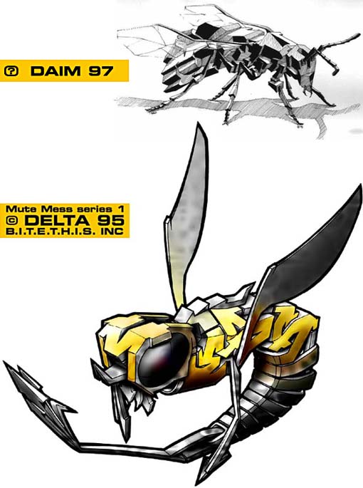
hmmm... makes me wonder.
don´t mean to diss ya, but that aint cool man.anyways.. hit me with tight critique.
- RevoltOne0
Watch it son.
I did that for daim, its in vector format so he could make a fuck w/ the style of it for tshits.
chimp.
- easy_target0
FIGHT FIGHT FIGHT..........
other than that the site looks good
just a couple of things that bug me1/ you lose the edge of the r and the e
as the image in them is white/light on the whit BG thus making it hard to read2/ having to wait for content to load after youve actually entered the site
- scarabin0
i like it, but make the r and e on the front page legible
- Client150
chimp hahaha.
rev.
If you made that for daim, thats cool. BUT wouldn´t it be wise to mention the original illustrator in it? I mean it´s pretty misleading for those who dont know about it.
-afterall you are a illustrator. and i´ve used to presume that illustrations in illustrators portfolio are original artworks, unless mentioned otherwise.as I said. dont mean to diss ya.
nothing but love from me, my baboon friend.