sitecrit please
- Started
- Last post
- 12 Responses
- Client15
http://client15.com/pikkugee/siv…
still under construction, no content etc. just the layout and basic actions.I´m not exacty a flash guru, but decided to do the construcion myself so I get more monnee.
the old site can be found at http://www.pikkug.com
thankyouverymuch.
- Client150
oh yeah.. It will be a "popup site"..
- monkeyshine0
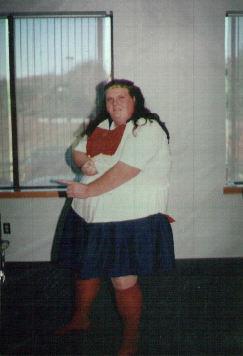
Hi. Why did you choose that background? Personally, I don't like it...doesn't seem to fit with the logo...and it also makes that guy look like the whitest guy on earth.
What's wrong with the old site?
- Client150
the background and the colorscheme are a "wish" from the artist. the old site has been up for some time now and they wanted a new "rougher" style on the site.
whatever that means.
personally I would have gone with lighter colors.
- chubba0
is that Derek?
- ganon0
inspiration...:
- iDp0

- chubba0
wuuuuuurrrrddd !!!!!
- monkeyshine0
no, here's inspiration...
dark colors are fine but that background looks dated...layout too. I'd also choose another photo because that guy looks silly...and did I say WHITE? ;)
- chubba0
"PULL MY FINGER BITCH!!!!"
- obey460
now thats gangsta
- GeorgiePorgie0
That looks like a Finnish version of Derek yo!
Bad-Ass!! Yup Word!
- Client150
lol guys :P
he is like the one of the most sold artists in finland (from finnish artists, ofcourse) and I have been making pretty much everything for him since the beginning... (scary, I know).
the basic layout was made with not too much time, and they loved it. -good and bad, because it´s always kinda struggle when changing things. I might try another background and hope they love it more... but theres always the darn deadline.thankz