crit logo
- Started
- Last post
- 22 Responses
- Deluxehorror
i was asked to make a logo for a sort of productionhouse called dp productions, they do audio, video and multimedia. This is what i got so far:
http://users.pandora.be/vegasroc…
I'm not happy with the results, one it feels more like a postal service logo or something
second, the font for the letters.
- johndiggity0
drop the dp in the type, it's redundant. lose the arial. you could do some sort of reel-to-reel symbol with those letters.
- Deluxehorror0
john, what do you mean with a reel-to-reel symbol?
- johndiggity0
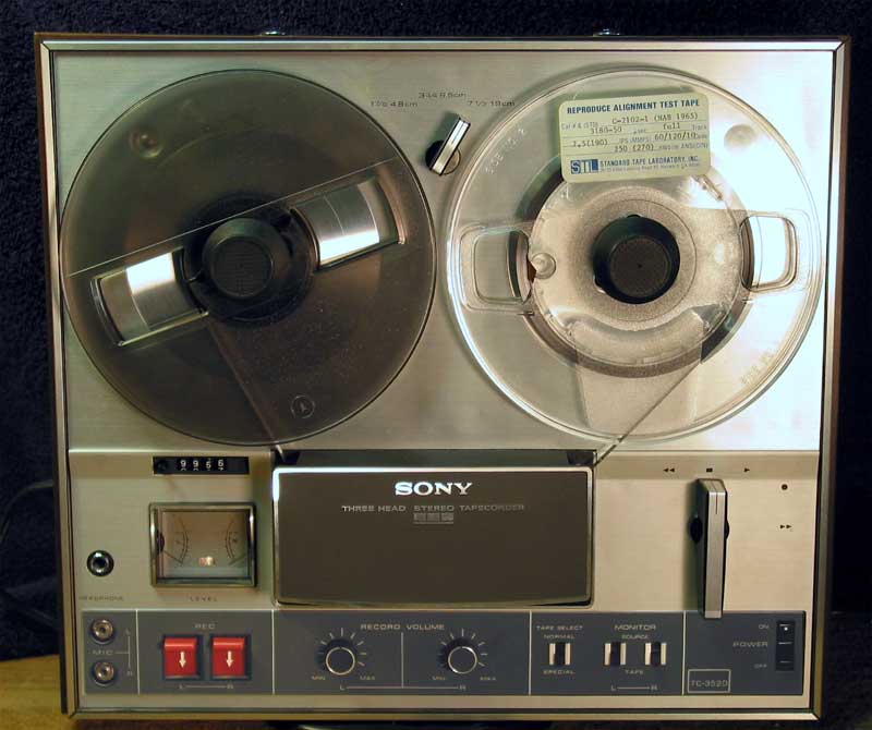
look at the shapes and go from there...
- Deluxehorror0
aha thx!
- warheros0
what about those logos say audio, video, or multimedia? reminds me of the abc logo.
looks uninspired.
- ********0
deluxehorror is one of the best names ever
- josimarX0
double penetration productions
- Deluxehorror0
warheros, i've said i wasn't happy with the results because it feels more like a postal service logo or something.
- dippy0
As my initials are DP, I have thought long and hard many times about making a logo using the lowercase letters dp, and thus am in the best position to crit your logos.
They suck. Listen to johndiggity.
Nah, I'm kidding. They don't suck, but they ain't knockin me over either. Definitely lose the Arial (and don't fall back on Helvetica either). Get out a pencil and paper and draw something.
- dopepope0
Interesting to see the DP being designed different ways. I've designed thousands of DP's for my self. It bugs me out to see other DP logos.
- dippy0
oh yeah, and visit dopepope's site to see how NOT to do your logo.
('Cos you don't want to end up being sued by his ass for copyright infringement)
- Deluxehorror0
hehehe
- dopepope0
I doubt the ones I have there are suitable for his task. But you never know.
- kbags0
Maybe drop the circle but keep the dp together?
Or go caps so it's like a circle with a line through it.
I think the colors are also making the design hurt a little...kinda NBA logoish. Try and swtich them up if you have the freedom...but really, logos should be designed in b&w first anyway, right?
Maybe invert the color on half the circle?
i don't think it's all that bad, but yes, the dp below is redundant.
- BNoir0
Have you thought about using dproductions and using colour to pull out the d and p? just a thought to mess around with - use the type as the logo.
But ultimately get out of Illustrator and get the pen and pad out. From experience, if you don't scribble cos you think you can;t sketch it, do it anyway, practice really does make perfect.
nice start tho.
- Deluxehorror0

a little more satisfied, but still...this is a good dp logo i think:

- ********0
yeah, this looks more like a reel to reel:
like this approach!
- johndiggity0
keep pushing and fix the type.
- forcetwelve0
yeah - looking better but still that type is bad.
try a semi-serif face perhaps? serifa/calvert or sumfin...
- Deluxehorror0
thx i'll get right to it!