hooray for type
- Started
- Last post
- 15 Responses
- ********0
nice bro :)
- ********0
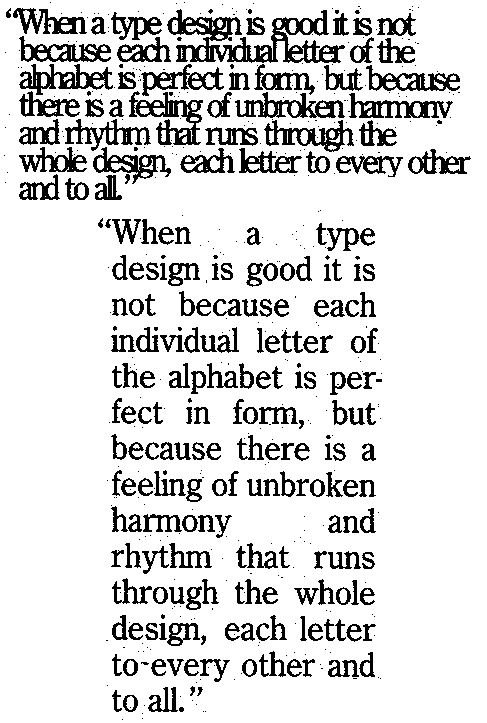
the kerning is a bit wacky though.
- stewart0
is it designed for screen or print?
letterspacing is too tight
and the wordspacing is horrible
please view or download this png file, look at it and read carefully
- rabattski0
huh? i see nothing. all white, no play.
- stewart0
(converted the png file to gif paul)
is it designed for screen or print?
letterspacing is too tight
and the wordspacing is horrible
please view or download this GIF file, look at it and read carefully

- rabattski0
ok so that is what is supposed to be seen @ that first link? odd.
- stewart0
haha rabattski
you can't see the first link, ohkay...
here, watch and shiver:

- rabattski0
is that supposed to be an optical illusion?
coz, the linespacing is moving. or no, it's more like, that linespacing is not right and when i look at it's right again and then the one above or below is wrong. etc.
or i need more coffee.
or it is because i stopped smoking.
- rabattski0
i... just... can't.... stop... looking..... it's...so.. beautiful...
whoah. who needs drugs man.
- Bunkum0
It doesn't matter if yer line spacing is too tight or too loose, it's just that you're aware of the spaces between letters and conscious of how that fit together. A friend has a page of copy where someone has individually kerned every letter. He says it looks really good but it's a bit extreme...
- Gorbie0
that is fucking with my eyeballs.
- leBeat0
haha, stewart!
thanks for this one! it’s already printed out to have a nice lunch-break!
:-)
- warheros0
hahahaha great, guys. ill keep that in mind. it's meant for print. just made it cause i was bored.
- warheros0
fixed/updated/&c
