my new logo
- Started
- Last post
- 41 Responses
- JoshClancy0
no?
- JoshClancy0
its not for a client its for me ... its gonna be my new web project.
I love the critiques thanks a lot man and glenroy thanks for your time so much man.
- Dublao70
What does the heart mean in all of this? I like the typeface, but the heart tagged on the end reminds me of my little sister. That's just me though. I say keep the font and go to town on your logo then come back for more critiques.
- zoobie0
dude, whatever happ to joshclancy.com?
- tomkat0
someone had to do it.
- lilbabyarm0
eh
- DutchBoy0
hhahahahahaha
- rasp0
better
;)
- JoshClancy0
umm... okay i want critiques you guys are just being dicks if you dont like it tell me why...
thanks.
- warheros0
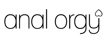
uhhh im thinking the heart should be a part of the y, like made with the same line, same line weight. i think the one with the heart off to the side doesnt really work, it's not refined and it's all seperate.
maybe make the color fade to red on the heart? i dont know. gradient change. think about it, fix the problem. dont go on whatever these jerk offs tell you, including me!
it's a nice direxion, just needs some refinement.
- motokiss0
mentioned earlier
leave the font, the font is nice so leave it.
As for the heart, u kinda want somthin that will be noticed without the font. So when people see it they will be like "oh shit thats analogy" so i would leave the heart or atleast do somthin with it.
I would love to see the outcome. All the best and good luck.
- dfx1800
It's precedence [the logo] seems to be aesthetics only; beauty and taste. Since the only application oriented information you can provide is it's your "new web project", any one playing the critic can only say they like or don't like -- not very objective.
The reason it's particularly important (with this logo) to explain its purpose further is because there are two main -- and very clear -- communicative elements i.e. a word and a shape.
There are predefined concepts/definitions for analogy and the symbol of a heart. What are you communicating outside (or with in) these predefined concepts?
What does your new web project have to do with Analogy and Love?
- T-B-O-A0
I agree with dfx180 and i'd like to add that the font and the heart work nice together aestheticaly but they seem like two different things.
What you want is one logo. My advice is to bring the heart up to the size and weight of the letters so that it becomes part of a letter or the word 'analogy' so you have a logo as a result instead of two half logos.
- T-B-O-A0
Check your email Josh
- JoshClancy0
okay I understand what you guys are saying and it was weird because i went back and i thought it was all the same weight
so here is the latest release of the analogy logo:

- ********0
Nah. I agree with the others. You've gotta tell people what this is for if you want a TRUE critique...otherwise, people are going to be bashing your work for its aesthetic appeal, when in fact, it may be perfect for its application.
As far as I can tell aesthetically....I don't like it, I don't hate it. The type is nice, but again, without knowing what it's for............................
The heart's not working where it is in your "new release". I think i'd incorporate it into the letter "y" by continuing the descender with the line drawing of the heart. That way, it's all connected and doesn't leave you wondering what the hell it's doing on its own where it was.Hope the didn't sound harsh. It wasn't intended to be. Good work so far...but then again........what the fuck do i know? ;)
- josimarX0
"The precedence [the logo]" – dfx180
welcome to NT but I think you maybe should return to your home planet asap. (probably Uranus)
- dfx1800
Josh, I only just noticed the descender on the g and the y differ. The wight looks better, but I think it might be highlighting that difference in the descenders.
Nice warm welcome there from Josi; cheers for that Josi. Lets not waste Josh's time attacking me; what do you say?
- Dublao70
Still don't like the heart, maybe because it's at the end of the word. Try moving it to the begining and see if that helps. I feel like my eye is rushing to the end of your logo to look at the heart and make a conection. The others may joke about anal love, but that could be b/c their eye skipped over the rest of the word, then saw the heart, and made the poop shoot conection.
- josimarX0
haha, just emailed you dfwhateveritis and I think you have taken what I said too seriously. I was just meaning chill out.