Logo of the Day
Logo of the Day
Out of context: Reply #854
- Started
- Last post
- 934 Responses
- ********-1
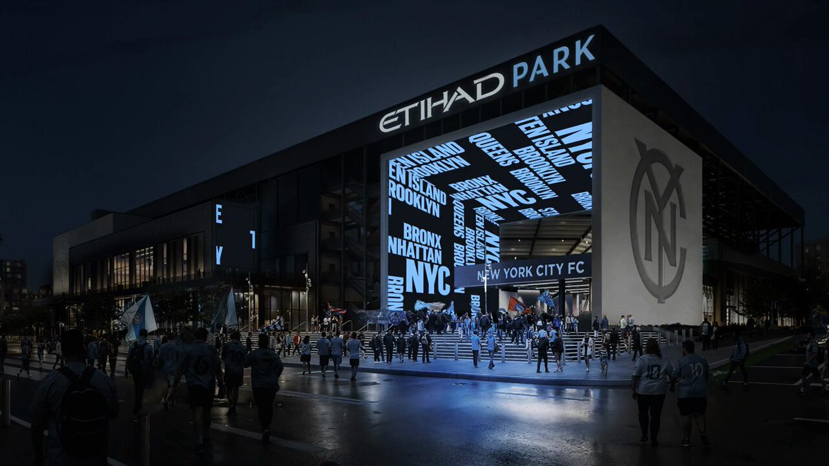
- One of the best this year *claps*********
- awful. two competing styles, and there's something weirdly fascistic going on with that monogram.hans_glib
- Disagree, hans. To me the styles complement and have a strong visual typographic relationship with each other and the city's heritage.monospaced
- fair enough, but you're wrong ;)hans_glib
- Of course I am.monospaced
- meh...utopian
- One of the best this year *claps*