Tweet of the Day
Tweet of the Day
Out of context: Reply #801
- Started
- Last post
- 1,598 Responses
- Salarrue0
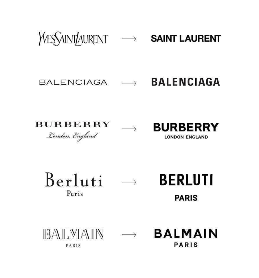
- "modernity"spl33nidoru
- I hate this tired opinion. It assumes that: a) The sans logos all look the same (they don't) and 2. that the logo is the sole visual identity asset (it's not)BaskerviIle
- The problems VI needs to solve these days are very different from when those old marks were created. It's a richer media landscape the logo is less of a focusBaskerviIle
- The logos are being modernised for good reason, and its clearly not impacting the success of the companies. Bored of these conservative commentators.BaskerviIle
- sorry to trigger you. The problem is not modernize, is to copy and paste a "modern formula" everywhere...Salarrue
- But they don't look the same. They look very very different - and always appropriate to the brand/label and their products********
- For example, Saint Laurent under Hedi Slimane sells very different clothes than under YSL so the new logo is very appropriate********
- Further Hedi Slimane's photo diary https://www.hedislim…
to see how his personal vision fits with the SL brand (as a CD of the house)******** - So when someone says all these logos look the same, I could tell they have no fucking clue about fashion, style, design and a bunch of other things...********
- No. As in any other medium, styles become similar to eachother cashing in the success or popularity of the other...Salarrue
- Fuck big brand fashion and their wet shops.Salarrue
- And, is evident that design in brands will change to keep a simpler modern look. As DIESEL or BENETTON did in the 90sSalarrue
- This is not the case. All these brands have very different clientele.
(also not reffering to you above)******** - grafician, I'd like for what you're saying to be true, but most of these brands' strategy is doing something solely because that's what the others are doing.spl33nidoru
- for the most part, I feel like gone are the days when the purpose of advertising was to distinguish yourself from the pack.spl33nidoru
- I wonder if their customers would think they all look the same.Chimp
- I think it’s due to Adobes crappy font previewing in illustrator and lack of being able to manage fonts. Easier if you just have 1 font you use for everything.shapesalad
- Berluti logo is sick!!!********
- The font choice is a signifier, that's it. The fashion is the brand. The brand is fashion. The type must speak to fashion.Nairn
- @shape that makes absolutely no sensemonospaced