Horrible Logos
Horrible Logos
Out of context: Reply #39
- Started
- Last post
- 48 Responses
- Nairn11
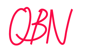
- https://www.qbn.com/…
:)Nairn - NNNNNGH
I didn't round the fucking stroke ends.Nairn - Well, makes it horribler, I guess.Nairn
- This is wretched, Nairn. Fucking dire.
Well done!Continuity - that kerning is on point!utopian
- Make it bigger and move the Q closer to the BRamanisky2
- So whois getting a tattoo?********
- I'm game for a Newstoday tattoo.
: )ideaist - Smells like Arby'sOriginal369
- getting this tattooed onKrassy
- Nairn post some vectors, we need this tattooed ASAP!********
- This would honestly get used somewhere. I worked on a project, fairly well-known building and instead of paying a designer to make a text logo for the sign...face_melter
- ...client asked someone in the office (not me). They did a shitty handwritten thing and drew it in Illustrator - badly - the sign is 2m high with bad joins andface_melter
- ...flat edges instead of being completely smooth and fluid. Fucking hilarious. I was like '...does no-one see this?'.face_melter
- OBNoxiouscannonball1978
- I can't believe this a) got the front page and b) is still there almost 24hrs later, haha.
you weirdos.Nairn
- https://www.qbn.com/…