Logo of the Day
Logo of the Day
Out of context: Reply #516
- Started
- Last post
- 934 Responses
- feel3
- flatten it! :)renderedred
- Terrible logo overall but if they got rid of the letters it would be perfect_niko
- I can’t think of a single other car brand that feels it Necessary add text to its badge. Everyone knows the white propeller against the Bavarian sky_niko
- vw - text is IS the badge ;)renderedred
- Mercedes has the full logo on the hood... Also Ford, GMC, Fiat, Jeep, Toyota. You just don't know cars very well :/zarkonite
- and they're not propellers, it's a common myth: https://www.logodesi…zarkonite
- oh yeah????? screw you guys!!!!!
lol_niko - plus all those companies typically use the logo only sans text unless it's only text, and none of them have it so awkwardly tacked on like BMW does_niko
- @niko what about alfa romeo?renderedred
- Mama Mia that’s a terrible logo too! Actually don’t mind it as much but still unnecessary. i also much prefer Ferrari horse without the text and yellow box_niko
- I like it. It was about time to move on from the old logo with that stupid effect.mekk
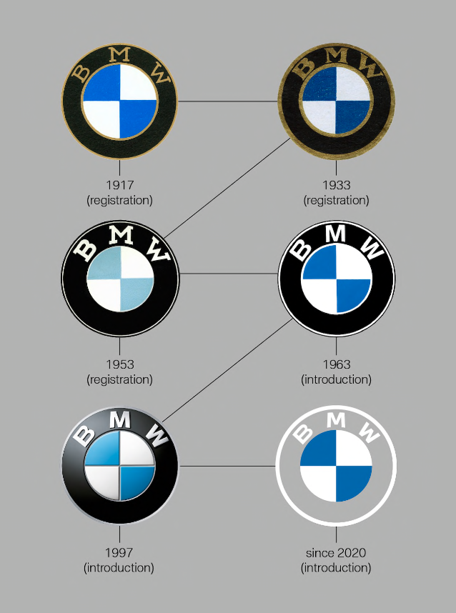
- https://www.bmw.com/…ideaist
- dumb x3utopian
- as they strive for going all electric, they just cut the "black oil" from the logo...********
- i'm down with '53.********