THE MET logo
THE MET logo
Out of context: Reply #10
- Started
- Last post
- 17 Responses
- maquito3
An example of correct ligatures (Mrs. Eaves by Emigre)
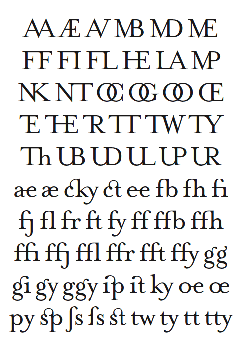
- Those U- ligs are awful.i_monk
- Really? why? They look fine to memaquito
- Kinda... those U ligs don't flow very well imo, but the guys at Emigre are the experts.VectorMasked
- the lowercase "sp" and "st" ligs have always kicked ass.VectorMasked
- Whoa. Never seen O and U used like that.pango