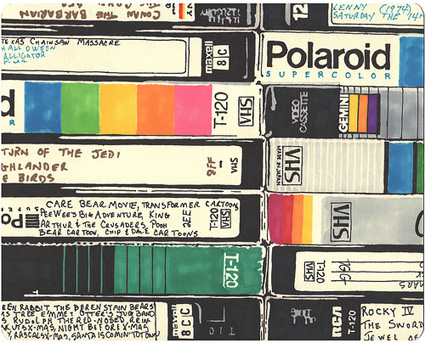
Tech Logos
Tech Logos
Out of context: Reply #9
- Started
- Last post
- 35 Responses
- mekk5
- Looks cool when you put them together like that, but in reality, the branding was total horeshit. Ugly, poorly executedCygnusZero4
- agree with cygnus - always thought they looked hideous on shelves.fadein11
- mekk -1 internet points todaymekk
- Nah, totally agree with you, mekk - I remember coveting certain brands of tape when I was younger. Sure, if you only bought cheap-ass tapes like those UR 90s...detritus
- ..you'd end up with crap-looking stuff - that's half the point of marketing differentation, isn't it? They're probably all the same things under the wrap.detritus
- some old stuff is quality, of course. this stuff? nah not really. more nostalgia talking. the design work is meh.CygnusZero4
- Always liked the look of theTDK SA 90 and SA 80. The matte black was nice.wordssssss
- Oh yeah, brother - TDK SA90s were teh gorjos.detritus
- so dope!bklyndroobeki
- I always liked the maxell joints. Had to record on those as a kid lolsublocked
- although they were poorly executed, they are quite memorable (perhaps because they were poorly executed)bklyndroobeki
- I liked the Maxell ones too. Still better quality than you get w/ mp3formed
- memorable through ubiquityfadein11
- All I remember is being really, really OCD with the alignments of labels, making sure they were utterly straight.Continuity
- some great colour palettes to be stolen from the designs.microkorg

