Nice initial logos
Nice initial logos
Out of context: Reply #1
- Started
- Last post
- 13 Responses
- CygnusZero40
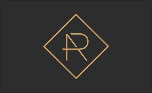
Decent example of what im looking for. Someone with the initials AR.
- That's nice.mg33
- squarespace one is decent tooCygnusZero4
- The A looks thicker? Letters off center?********
- Amateur.********
- I said DECENT. jesus lolCygnusZero4