ios7
ios7
Out of context: Reply #440
- Started
- Last post
- 546 Responses
- jtb260
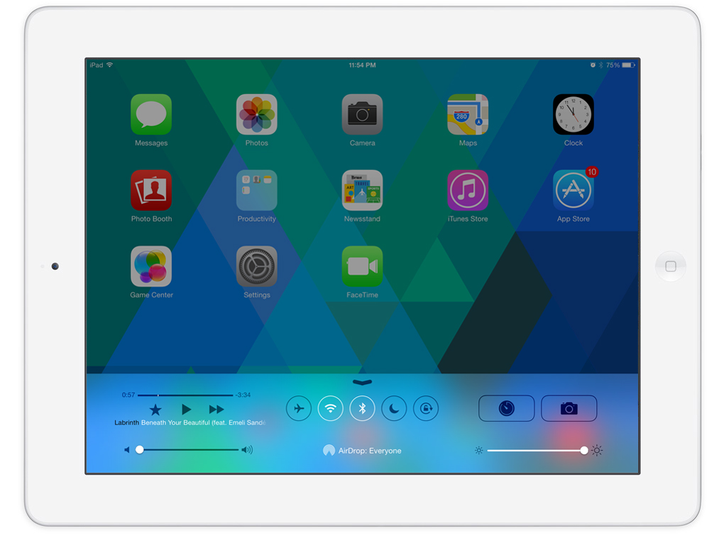
I've found that iOS7 is way nicer on the iPad. When everything has a little more room to breath the whole look is far more harmonious. Looking at it on my phone it feels crunched together.

I will say that the "make type legible" setting is kind of ridiculous. When you sit down and decide you have to make it a setting, maybe it's time to reexamine how you've implemented typography overall.
- illegible for individuals who have difficulty with vision.ohhhhhsnap
- it really is much better on the ipad, the grid actually makes sense.kingsteven
- the option is for ignoramus' to switch it on, then switch it back a few weeks later.doesnotexist